DataPallas v14: Go Deeper With Embeddable Analytics & OLAP
Virgil
With each major release we like to pick one area of the platform, go deep, and make it significantly better.
With v14 we chose Embeddable Analytics & OLAP — the data-driven web components you drop into dashboards
and web apps: datatables, charts, and pivot tables.
The result: a much larger example library, a Redis caching layer for faster dashboards, and performance
work that keeps the browser responsive even against million-row datasets.
Extensive Examples for Tables, Charts, and Pivot Tables
Good data-driven components are only useful if you know what they can do. v14 ships with a large library of live, copy-paste-ready examples across all three component families:
Data Tables — Layout modes (virtual DOM, fit-to-data, fit-to-width), interaction patterns (sorting, filtering, pagination, editing), and advanced scenarios (grouped rows, column calculations, tree data, spreadsheets).
Charts — Line, bar, grouped bar, stacked bar, pie, doughnut, dual-axis mixed, area, radar, scatter, bubble, waterfall, funnel, heatmap, treemap, gauge, and candlestick — each with realistic business data and configuration you can copy straight into your project.
Pivot Tables — Fundamentals (sum, cross-tab, multi-dimension), filtering and sorting, every renderer (table, heatmap, bar chart, line chart, area chart, scatter), all aggregators, and advanced features like derived attributes and subtotals.
Every example includes a Configuration toggle so you can inspect and copy the exact Configuration that drives it. Browse, pick, paste, done.
Loading…
tabulator {
  height "311px"
  layout "fitColumns"
  columns {
    column {
      title "Name"
      field "name"
      width 150
    }
    column {
      title "Progress"
      field "progress"
      formatter "progress"
      formatterParams([color: ["#00dd00", "orange", "rgb(255,0,0)"]])
      sorter "number"
      width 100
    }
    column {
      title "Rating"
      field "rating"
      formatter "star"
      formatterParams([stars: 6])
      hozAlign "center"
      width 120
    }
    column {
      title "Driver"
      field "car"
      hozAlign "center"
      formatter "tickCross"
      width 50
    }
    column {
      title "Col"
      field "col"
      formatter "color"
      width 50
    }
    column {
      title "Line Wraping"
      field "lorem"
      formatter "textarea"
    }
  }
}
Loading…
chart {
  type 'bar'
  data {
    labelField 'Quarter'
    datasets {
      dataset {
        field 'Revenue'
        label 'Revenue ($)'
        backgroundColor 'rgba(78, 121, 167, 0.7)'
        borderColor '#4e79a7'
        borderWidth 1
        yAxisID 'y'
        order 1
      }
      dataset {
        field 'ProfitMargin'
        label 'Profit Margin (%)'
        type 'line'
        borderColor '#e15759'
        backgroundColor 'rgba(225, 87, 89, 0.1)'
        borderWidth 3
        pointRadius 5
        pointStyle 'circle'
        tension 0.3
        fill false
        yAxisID 'y1'
        order 0
      }
    }
  }
  options {
    responsive true
    plugins {
      title { display true; text 'Revenue & Profit Margin' }
    }
    scales {
      y {
        type 'linear'
        position 'left'
        beginAtZero true
        title { display true; text 'Revenue ($)' }
      }
      y1 {
        type 'linear'
        position 'right'
        beginAtZero true
        max 100
        title { display true; text 'Margin (%)' }
        grid { drawOnChartArea false }
      }
    }
  }
}
The pieces are all there: a data warehouse (DuckDB for in-process analytics, ClickHouse when you outgrow it), data-driven web components for tables, charts, pivot tables, and parameterized filters — each embeddable in any web page.
You think putting it all together into a dashboard would be difficult? Not at all — just ask Athena.
Have a conversation with her — tell her what you're thinking, what you'd need, who the audience is. For instance: "Design a BI dashboard for our CFO — which KPIs should it include?" She considers the audience, the decisions they face, and the metrics that actually drive those decisions. Then she generates a complete mockup — layout, chart types, data tables — ready to review.
Iterate from there. Swap a metric, rearrange panels, add a date range filter. Each turn sharpens the result. When you're happy with the design, connect it to your real data with DataPallas's web components — or let Athena handle the wiring too.
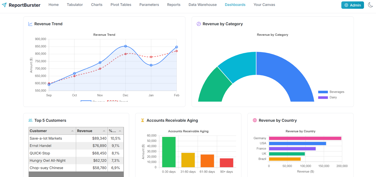
Here is the CFO dashboard she produced over the Northwind sample data warehouse — revenue trends, profit margins, AR aging, top customers, geographic distribution — from a single prompt:
— Connected to Northwind (sqlite). Ask me anything! —
Now give me an HTML mockup of a BI Analytics dashboard for our CFO — which KPIs do you think they would look for?
Financial Health— Total Revenue ($847K) + growth trend, Gross Profit ($292K) + margin (34.5%), Outstanding AR ($128K)
Operational Performance— Total Orders (1,247), avg. $680/order, Days Sales Outstanding (28 days, below 30-day target)
Customer & Product Insights— Top Customer: Save-a-lot Markets ($89K), Top Product: Côte de Blaye, Top Region: Germany (23.4%)
Risk Management— AR Aging buckets ($42K at risk in 60+ days), Revenue by Country (geographic concentration)
The dashboard uses a dark theme with glassmorphism effects — professional, modern, and data-dense for executive decision-making.
Ready for more tests!
Copy
Ask a question about your data...
Athena is part of the DataPallas AI Crew introduced in v13 — domain-expert AI agents that learn your projects and get sharper with every conversation. See the full walkthrough in the Dashboards documentation.
Redis Starter Pack — Your Dashboards Are About to Get Faster
v14 adds a Redis Starter Pack — launch it from the Starter Packs UI and your data-driven components start serving cached results in milliseconds instead of hitting the database on every page load.
The first request queries the database and populates the cache; every subsequent request is served from memory until the TTL expires. For dashboards with many concurrent viewers or expensive aggregation queries, the speed-up is immediate and significant.
Next: Make It Even Faster
Once your dashboard is running, the Performance & Real-Time guide walks you through the next level: bundling multiple visualizations into a single multi-component report, loading only the data each component needs via componentId, setting up Redis caching and TTLs, and pushing live updates with Redis Pub/Sub.
Pivot Tables — cross-tabs, heatmaps, and OLAP analysis
Like what you see but too busy to set it up yourself? We'll do it for you — just tell us what you need.
From simple setup and configuration walkthroughs, to building custom reports, to deploying fully custom document portals and BI dashboards — we handle it all.
Don't want to deal with infrastructure? We host the whole solution. You'll just log in as admin and enjoy fully automated document workflows.