Dashboards
Build interactive dashboards combining charts, pivot tables, data tables, and reports into unified views.
DataPallas is a domain-agnostic data platform — the video above walks through building dashboards for an algorithmic trading platform, but the same approach applies equally to ERP, CRM, Finance, Accounting, or any other business domain.
For a deep-dive into the algo trading example, read this blog post. For a concise, step-by-step reference on building dashboards in general, read on.
Table of Contents
- Everything You Need Is Already Here
- How To Build Dashboards
- Approach 1: Build Dashboards Using the Data Canvas
- Approach 2: Fully Configure Every Aspect of the Dashboards
- The Building Blocks
- Atomic Values (rb-value)
- Supported Databases
- Next: Make It Fast
Everything You Need Is Already Here
You have the data. You have the data warehouse — DuckDB for fast embedded analytics, ClickHouse for enterprise scale. You have powerful OLAP engines that handle everything from 100 rows to 10 billion. You have data-driven web components — pivot tables, charts, data grids, and parameterized reports — ready to drop into any page.
So what would stop you from building the best BI dashboards in the world?
Nothing. Absolutely nothing.
Note: Below you will see various code snippets — scripts, HTML templates, component configurations. None of this code needs to be written by hand. DataPallas's built-in AI tools generate everything for you. Just click the "Hey AI, Help Me with..." buttons and describe what you need.
How To Build Dashboards
DataPallas offers two alternative ways for building dashboards.
Approach 1: Build it on the Data Canvas is the more exploratory, visual path. Drop cubes or tables onto the canvas, try different chart shapes, drag and resize widgets — see your data take shape before you commit to anything. When you're happy, click Publish Dashboard.
Approach 2: Fully Configure Every Aspect of the Dashboard gives you full control. You provide the data-fetching script (DataPallas uses Groovy — a concise, readable scripting language), configure each widget precisely, and own the layout down to the last detail. That said — you are not expected to write any of those scripts yourself. Everywhere a script is needed, DataPallas puts a "Hey AI, Help Me with..." button right there. Don't be shy: AI is great at this, and more often than not it hands you the exact script you need on the first shot. Of course, if you prefer to write the scripts yourself, you can do that too.
The end result is exactly the same, regardless of which path you take. Both approaches produce the same report configuration files on disk — a data script, an HTML template, per-component configurations — so there is no "better" method. They are genuinely equivalent.
This gives you tremendous flexibility. A practical strategy when building something new: start on the Data Canvas, explore the data visually, and publish a solid working prototype in minutes. Then go and check the exported dashboard configurations in DataPallas and fine-tune the scripts, layout, and component configs until the dashboard is exactly where you want it. The best of both worlds.
Approach 1: Build Dashboards Using the Data Canvas
This approach lets you visually explore your data and configure most widgets entirely through the UI — no code needed. And when you need more power, the Finetune option is always there: switch to a custom SQL query or a script for any individual widget without leaving the canvas.
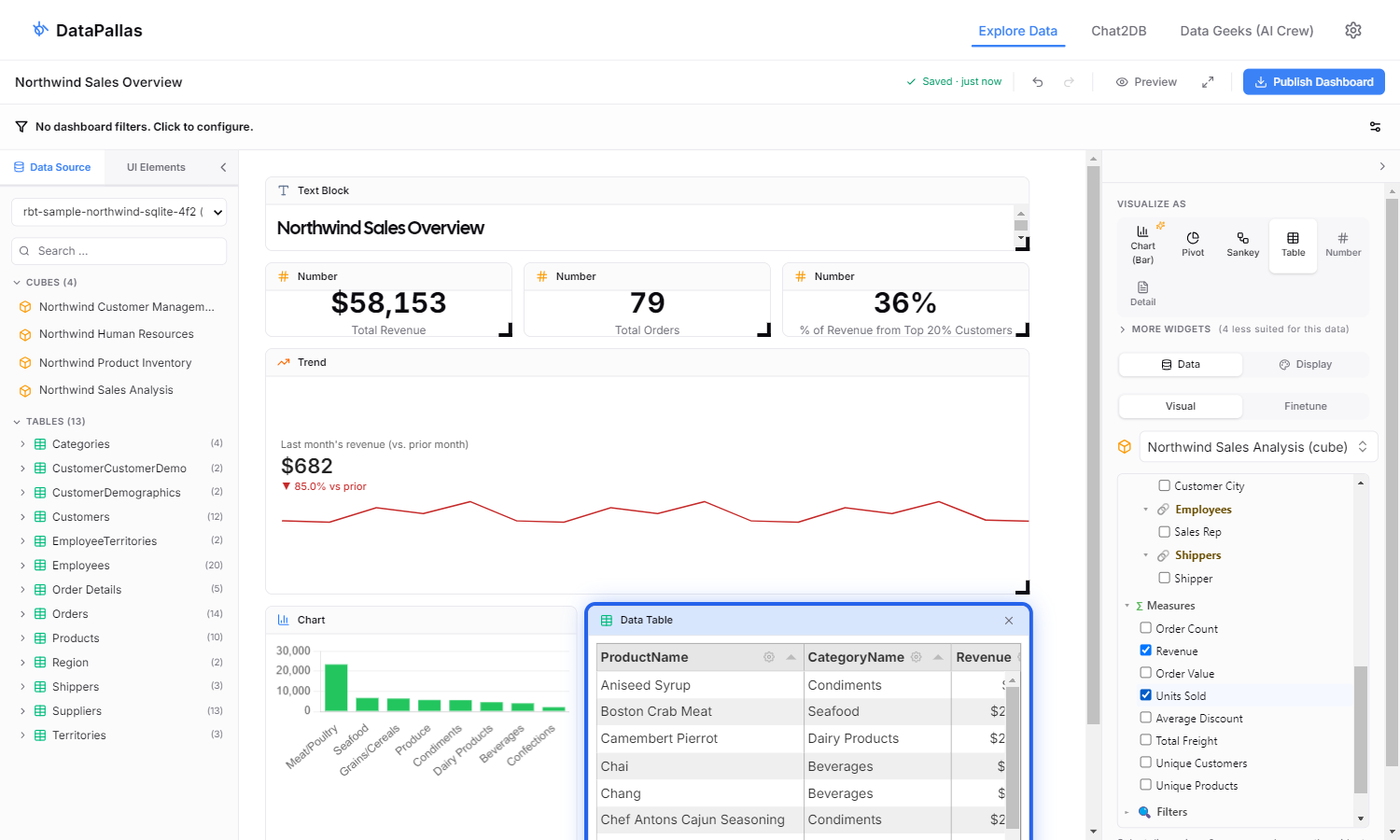
The dashboard below is a good real-world example of that mix. It has six widgets total:
- 4 widgets configured entirely through the UI — drop a cube, tick a couple of fields, pick a visualization
- 1 widget using Finetune SQL — to bucket revenue by month, which requires a custom time-grouping query the visual builder can't express
- 1 widget using Finetune Script — to calculate the Pareto share (what % of revenue comes from the top 20% of customers), which requires distribution math across all rows
This covers the situations you'll realistically meet when building your own dashboards: many things you configure through the UI or, when you need increased flexibility, with a targeted SQL or script. The bundled database Northwind SQLite sample ships with DataPallas, so you can follow along on a fresh install.
(And yes — do we even need to remind you again? The "Hey AI, Help Me with..." button is right there for both the SQL and the script. 😄)
Step 1 — Open the Canvas
From DataPallas: Processing → Explore Data & Build Dashboards, start the Explore Data Canvas app, then click Launch to open the app in a browser.
The landing page lists all your dashboards — this is where newly created dashboards will appear. DataPallas ships with two sample dashboards so you can see what a finished result looks like before you build your own.
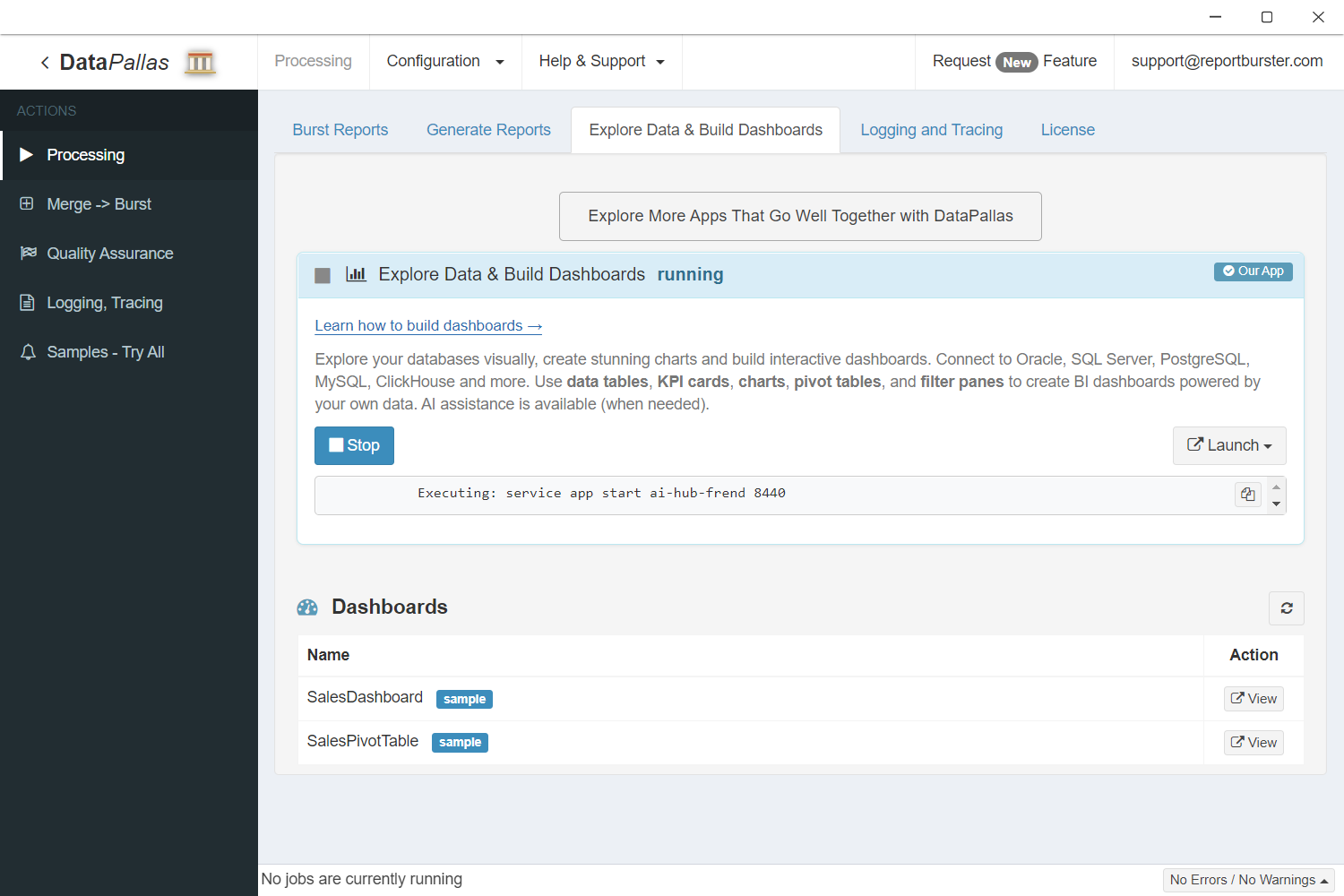
Click + New Canvas, name it Northwind Sales Overview, and in the left-panel connection dropdown pick the bundled rbt-sample-northwind-sqlite-... connection. The cube list and table tree populate — you're ready to drop widgets.
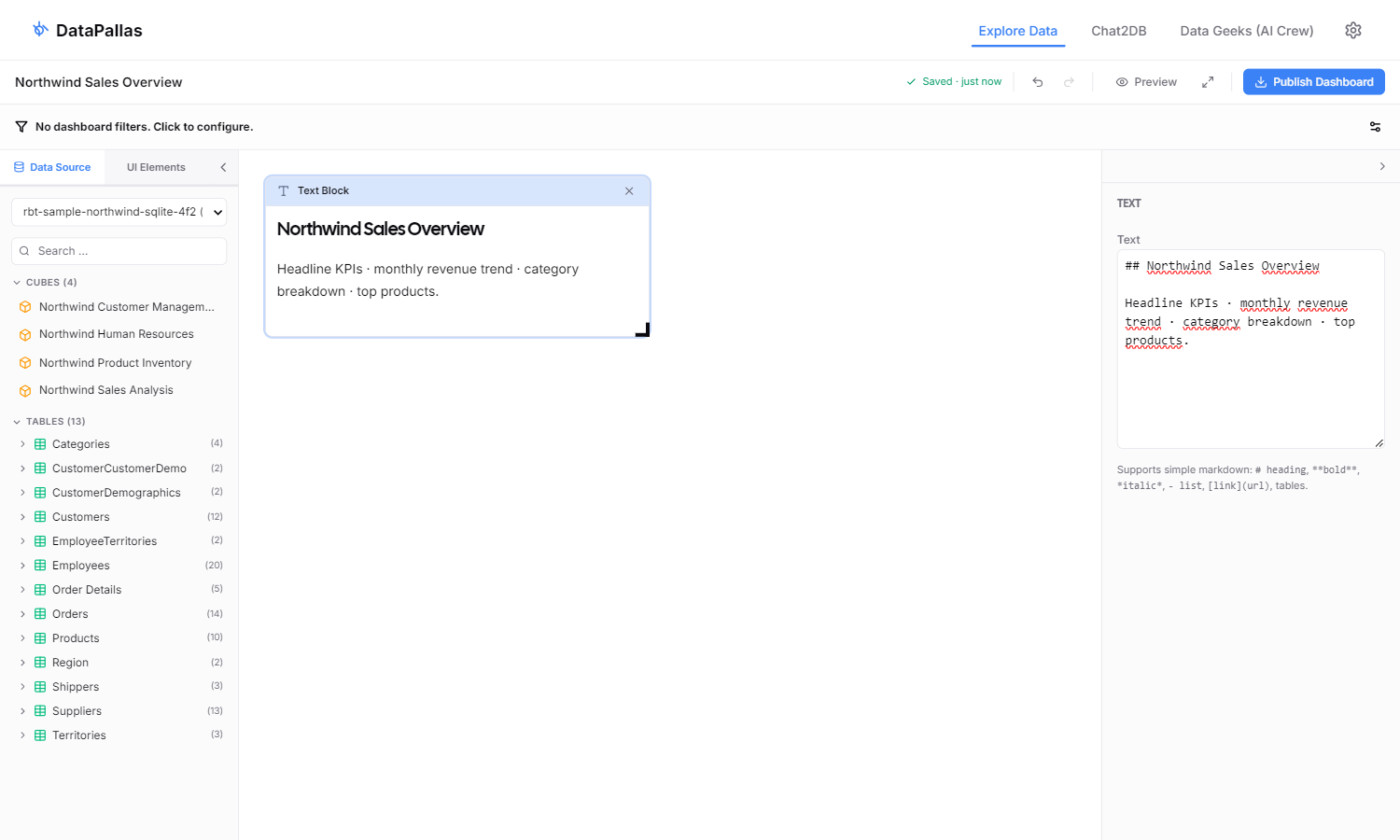
Step 2 — Add a Title
Good dashboards lead with context, not numbers. Drop a Text UI Element at the top of the canvas to give the dashboard a clear title and a one-line summary of what's on it.
- In the left panel, click the UI Elements tab.
- Click + Text. An empty Text widget appears.
- In the Display panel on the right, paste a markdown heading and a one-line subtitle. Markdown's
##is a section heading; plain text after it becomes a subtitle line.
Each step's screenshot below highlights the just-added widget with a blue ring so you can see exactly which piece of the canvas this step builds.
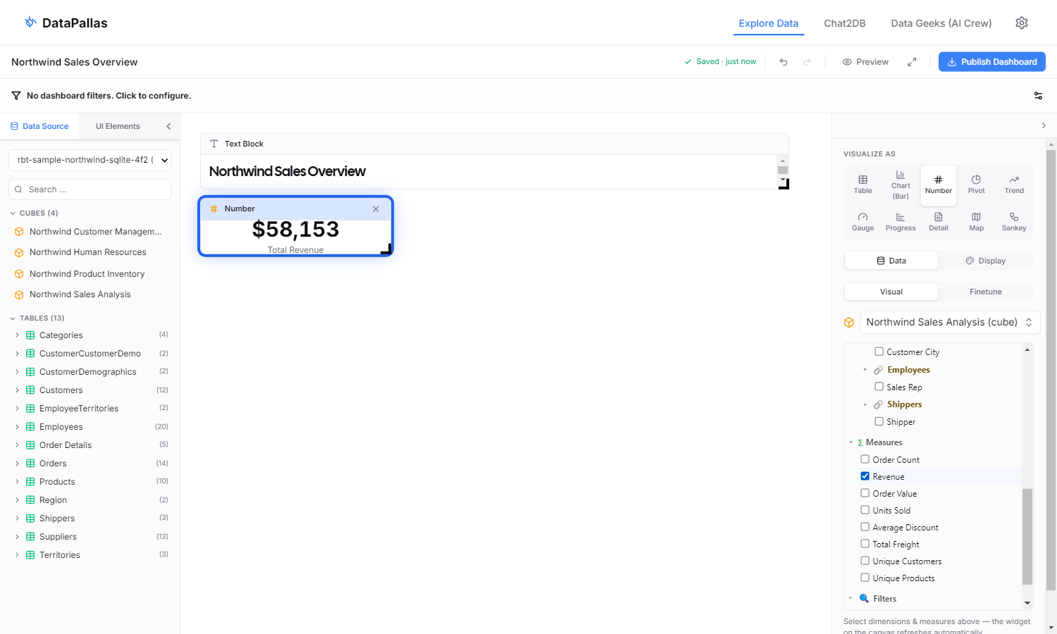
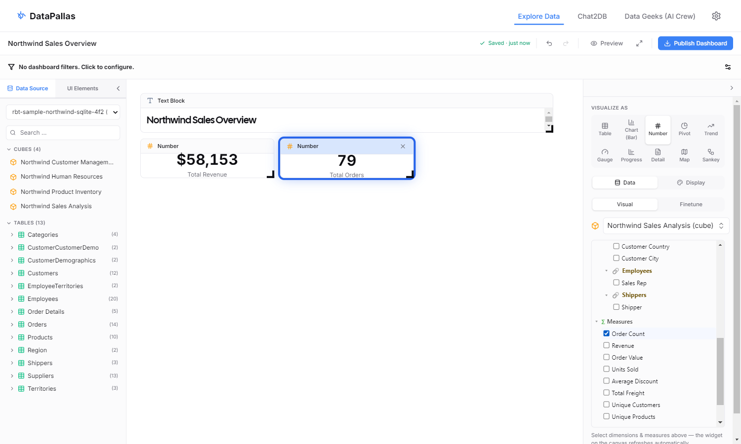
Step 3 — KPI: Total Revenue
The simplest visual flow: drop a cube, tick one measure, pick Number. With zero dimensions ticked the cube emits SELECT SUM(Revenue) FROM cube — no GROUP BY — which is exactly what a top-line KPI wants.
- Click the Northwind Sales cube. A widget appears on the canvas, and the right panel opens its cube tree.
- In the cube tree, tick Revenue under Measures. The widget refreshes (you'll see a tiny single-row table).
- In the VISUALIZE AS strip, click Number. The widget reshapes into a big number.
- Switch to the Display tab and set Label →
Total Revenue. (Without an override, the raw field name "Revenue" leaks into the UI.)
You now have your first KPI card. The screenshot shows the rendered value AND the right-panel cube tree with Revenue ticked — the inputs that produced the output.
Step 4 — KPI: Total Orders
Same flow as Step 3, different measure. Drop the Northwind Sales cube again, tick OrderCount (instead of Revenue), switch viz to Number, set the Label to Total Orders. The CamelCase measure name OrderCount would otherwise leak straight to the user — the label override fixes that on the canvas AND in the published dashboard (the override is persisted in displayConfig.numberLabel).
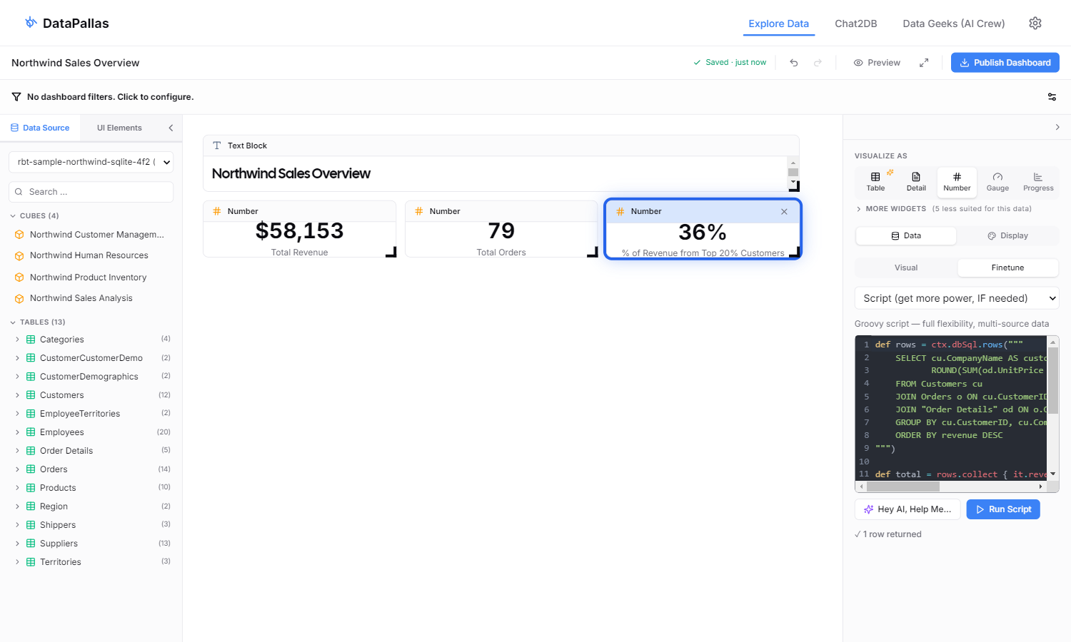
Step 5 — KPI: Top-20% Customer Share (Finetune Script)
"What % of revenue comes from the top 20% of customers?" needs distribution math: query all customers, sort by revenue, slice the top quintile, divide. The cube tree's checkboxes can't express this — it's the first widget where we reach for Finetune → Script.
- Drop the Northwind Customers cube.
- Switch viz to Number first (so the single-row script result lands in the right shape).
- In the right panel click Finetune → Script and paste:
def rows = ctx.dbSql.rows("""
    SELECT cu.CompanyName AS customer,
           ROUND(SUM(od.UnitPrice * od.Quantity * (1 - od.Discount)), 2) AS revenue
    FROM Customers cu
    JOIN Orders o ON cu.CustomerID = o.CustomerID
    JOIN "Order Details" od ON o.OrderID = od.OrderID
    GROUP BY cu.CustomerID, cu.CompanyName
    ORDER BY revenue DESC
""")

def total = rows.collect { it.revenue }.sum() ?: 0
def topN = Math.max(1, (int)Math.ceil(rows.size() * 0.20))
def topRevenue = rows.take(topN).collect { it.revenue }.sum() ?: 0
def share = total > 0 ? (topRevenue / total) * 100.0 : 0

return [[
  "Top 20% Share": Math.round(share) / 100.0,
  "Top N Customers": topN,
  "Total Customers": rows.size()
]]- Click Run. Set Label →
% of Revenue from Top 20% Customersand Format → Percent (the script returns the fraction0.36; the percent formatter renders it as36%).
Don't write this from scratch. Click Hey AI, Help Me… above the editor and describe what you want ("Pareto share — what percent of revenue comes from the top 20% of customers"). DataPallas drafts the script against your live schema; you tweak and click Run.
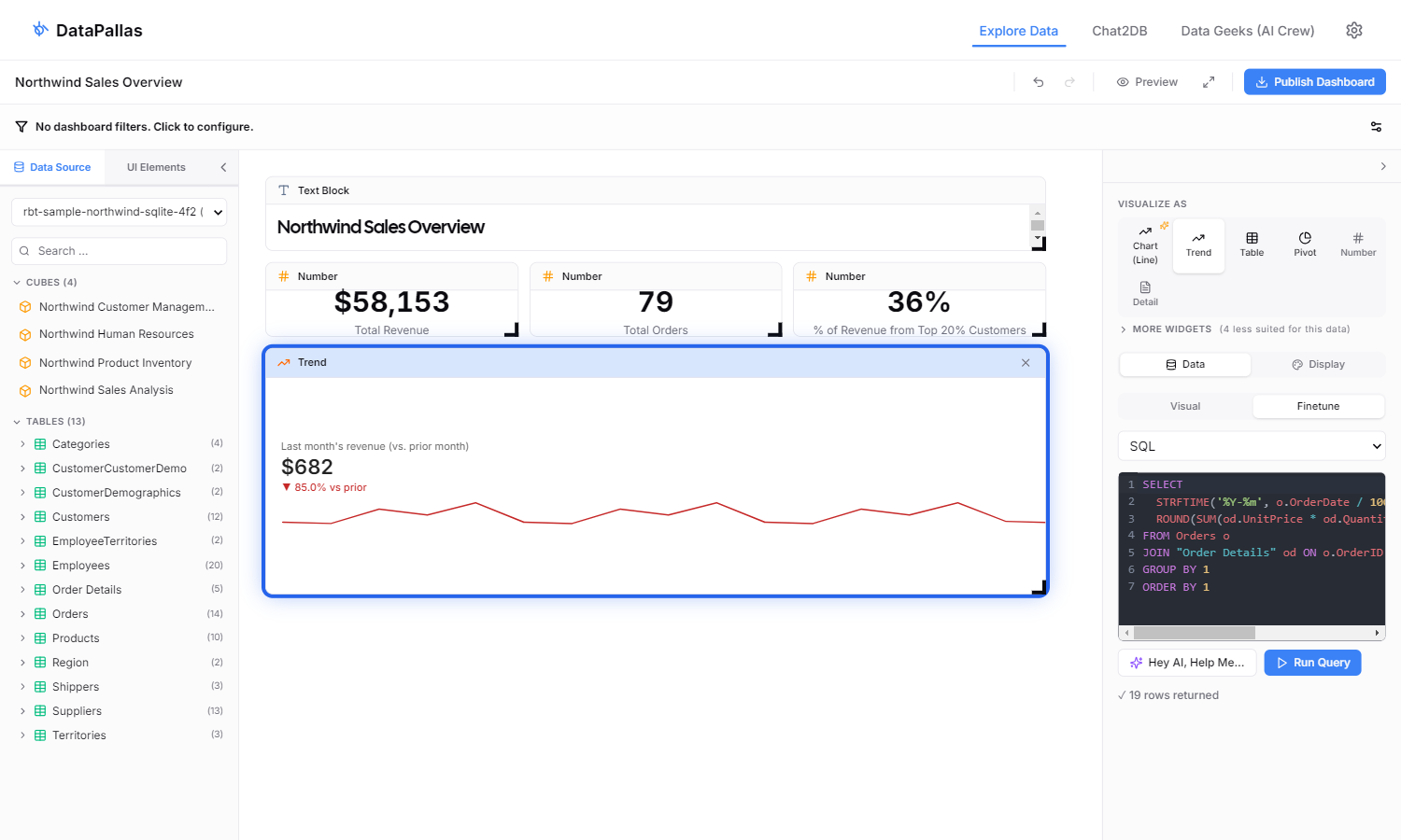
Step 6 — Trend: Monthly Revenue (Finetune SQL)
The Trend widget (<rb-trend>) shows "current vs prior period" — only meaningful when the data is bucketed. Cube visual mode groups by raw OrderDate (~daily granularity), giving the headline a noisy day-over-day delta. Switch to Finetune → SQL and bucket monthly:
- Drop the Northwind Sales cube.
- In the right panel click Finetune → SQL and paste:
SELECT
  STRFTIME('%Y-%m', o.OrderDate / 1000, 'unixepoch') AS month,
  ROUND(SUM(od.UnitPrice * od.Quantity * (1 - od.Discount)), 2) AS revenue
FROM Orders o
JOIN "Order Details" od ON o.OrderID = od.OrderID
GROUP BY 1
ORDER BY 1- Click Run, then VISUALIZE AS → Trend. Set the trend label to
Last month's revenue (vs. prior month)so the▼ X% vs priordelta reads unambiguously.
The /1000, 'unixepoch' modifier is required because Hibernate persists OrderDate (a Java LocalDateTime) as epoch milliseconds; SQLite's STRFTIME expects ISO strings or epoch seconds. Without the divide-by-1000, every row collapses to a single NULL group and the headline shows the grand total with no sparkline.
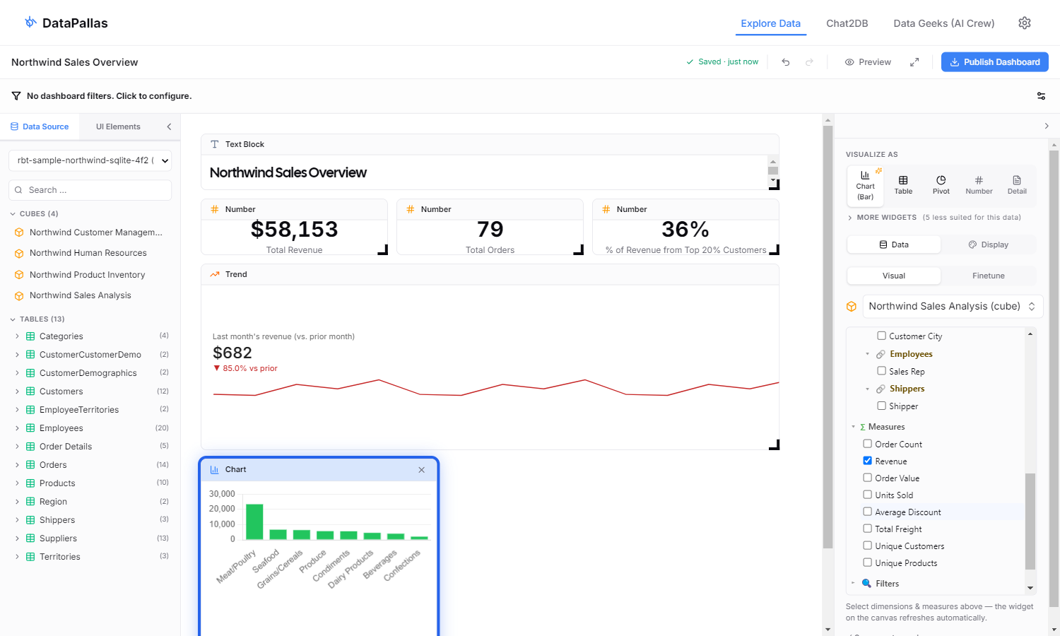
Step 7 — Chart: Revenue by Category
Back to pure visual mode. Drop the Northwind Sales cube again. In the cube tree tick CategoryName (under Dimensions) and Revenue (under Measures). Switch the viz to Chart. Eight bars, one per Northwind category.
Cube mode emits GROUP BY CategoryName ORDER BY CategoryName, so bars come out alphabetical (Beverages, Condiments, … Seafood). If you specifically need them sorted by revenue instead, that's a Finetune-SQL job — ORDER BY revenue DESC — but for most dashboards alphabetical is fine.
Step 8 — Tabulator: All Products
The product leaderboard. Drop the Northwind Sales cube. Tick ProductName + CategoryName dims and Revenue + TotalQuantity measures. Switch the viz to Tabulator. You get a click-sortable table with one row per product — click the Revenue header once to sort descending, and you have your leaderboard. (The bundled Northwind sample database has 20 products; on a real dataset you'd see one row per distinct ProductName/CategoryName combination.)
(Cube mode has no LIMIT N support, so this returns all rows. For a hard "Top 10" with LIMIT 10 you'd switch to Finetune SQL — but with sortable columns the user can click their way to a leaderboard view at runtime.)
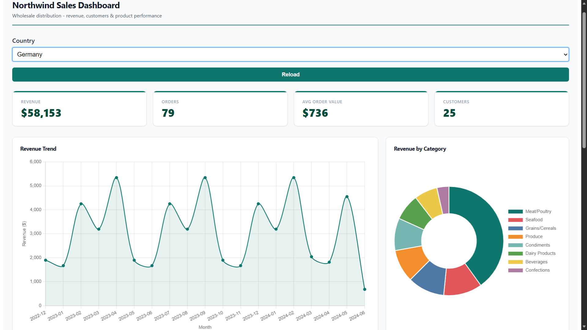
Step 9 — Publish Dashboard
The dashboard is fully built. Six widgets — three KPI cards, a monthly trend, a category chart, and a product table — laid out across the canvas in a clean three-row grid. The screenshot below is the final canvas WITHOUT any blue-ring highlight: this is what your dashboard looks like, ready to publish.
Click Publish Dashboard in the top-right toolbar. DataPallas exports the canvas into a regular Report:
- A data script with one
if (!componentId || componentId == '...')block per widget — the SQL/script you wrote in each Finetune tab goes verbatim into the corresponding block. - An HTML template with
<rb-value>/<rb-trend>/<rb-chart>/<rb-tabulator>web components wired to those component IDs. - Per-component configurations (Tabulator columns, Chart options, etc.).
The dashboard appears in DataPallas's dashboards list with a shareable URL, embeddable via <rb-dashboard> in any external page, and reachable via ${dashboard_url} in scheduled emails — exactly like a dashboard built directly as a Report (next section).
Approach 2: Fully Configure Every Aspect of the Dashboards
The other path: skip the canvas and author the dashboard directly in Report Generation — a data script, an HTML template, and per-component configurations (small declarative config scripts, one per component). Best when you want full HTML/CSS layout control from the start, or when the dashboard's logic is complex enough that you'd rather write/AI-generate it once than configure widget-by-widget. Below: the ~5-minute Northwind walkthrough.
Can you get this dashboard done in 10 minutes? Let's see...
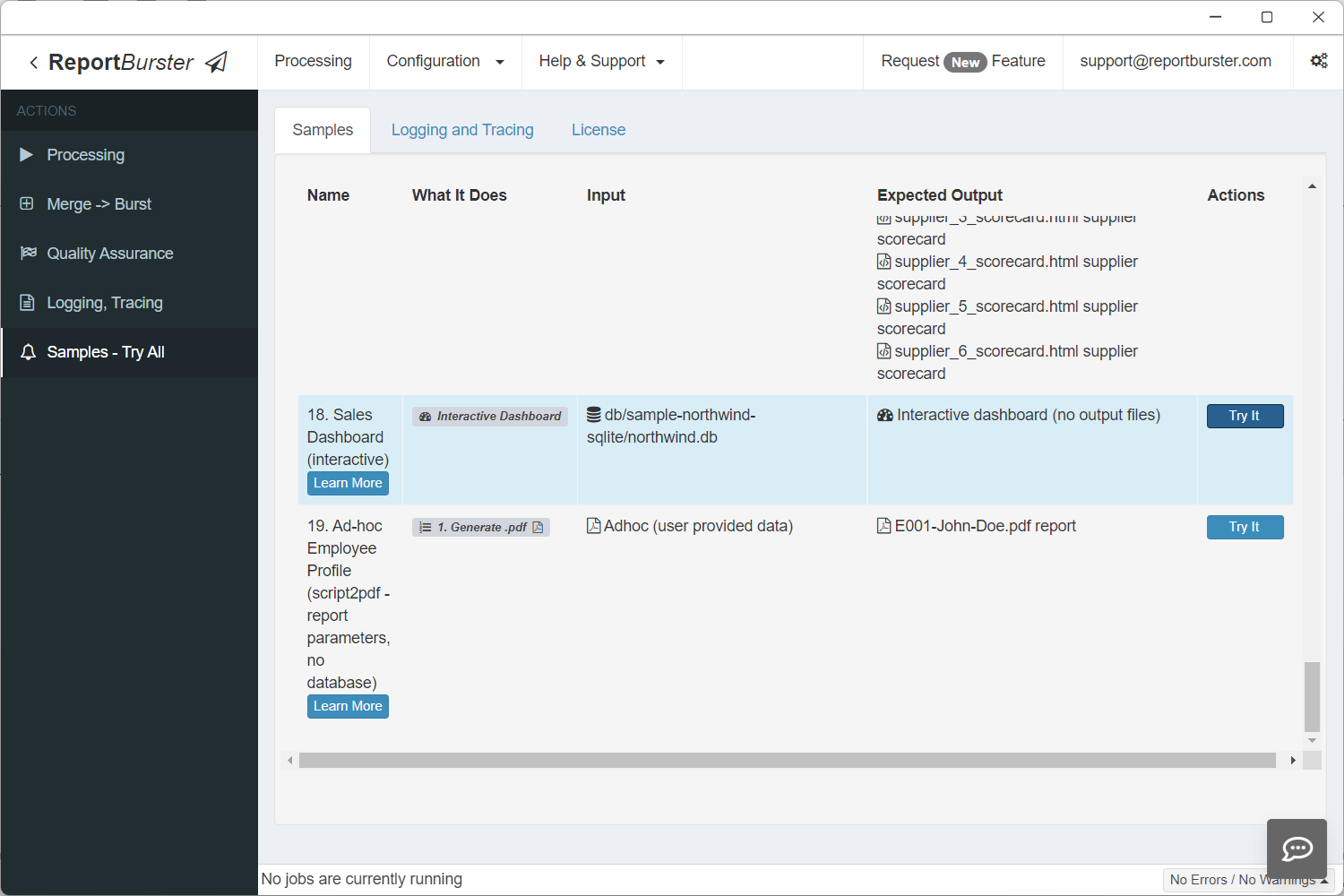
Want to see it before you build it? This exact dashboard ships as a built-in sample. Go to Samples — Try All and click Try It on the Sales Dashboard entry to open the live, working dashboard instantly — no configuration needed.
Follow these steps to build a working Northwind Sales Dashboard — complete with KPI cards, charts, a data table, a pivot table, and a country filter. We'll use pre-canned configuration so you can focus on learning the workflow.
Note: The Northwind SQLite database already ships with DataPallas and contains all the data needed for this tutorial. To get the dashboard up and running as fast as possible, simply copy each code snippet below into the corresponding tab — get your dashboard ready in 5 minutes (and, along the way, learn how to do it for yourself).
When building your own dashboards over your own data, you'd use the AI tools built into DataPallas to generate all the code. We'll show you exactly where those buttons are at each step.
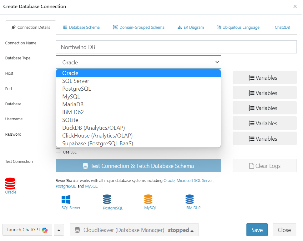
Step 1: Configure the Database Connection
The sample Northwind SQLite database is included with DataPallas — no Docker or external setup needed. Go to Configuration → Connections (Email, Databases) and configure your connection.
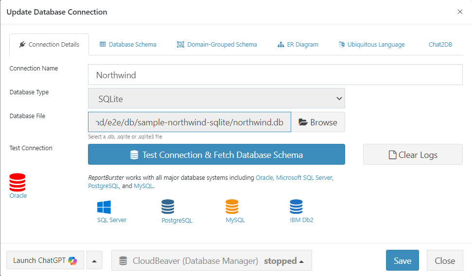
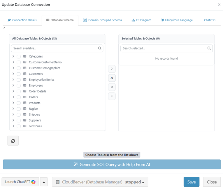
Click Test Connection & Fetch Database Schema. DataPallas validates your connection and retrieves the complete database schema.
Step 2: Create the Report
Step 3: The Datasource
On the DataSource tab, set the Input Type to Script (for fetching dashboard data) and select the database connection you created in Step 1 (e.g., Northwind (default)) from the Database Connection dropdown.
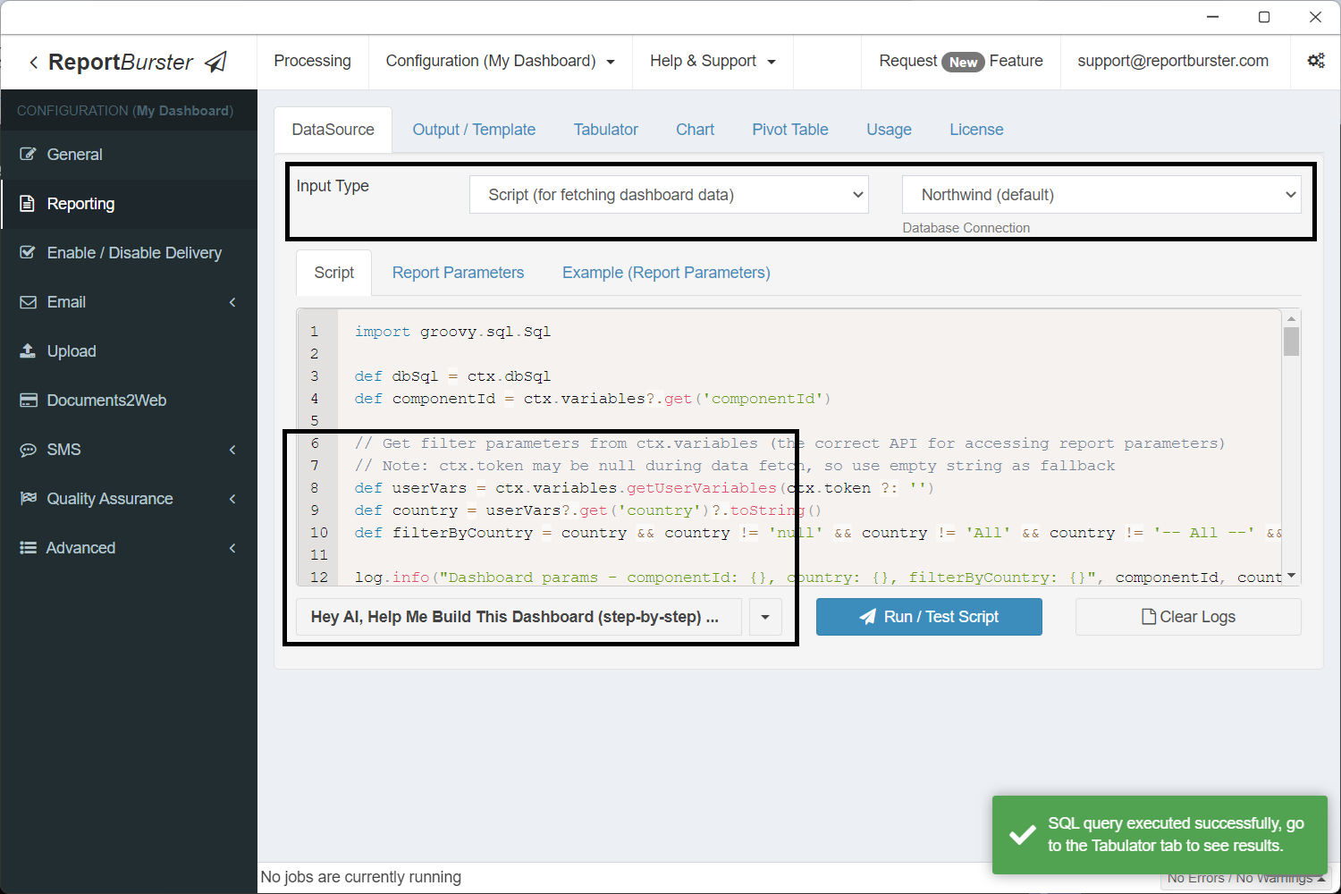
In practice you'd let the built-in AI write this script for you. For now, grab the ready-made script below so we can jump straight to the dashboard.
import groovy.sql.Sql

def dbSql = ctx.dbSql
def componentId = ctx.variables?.get('componentId')

// Get filter parameters from ctx.variables (the correct API for accessing report parameters)
// Note: ctx.token may be null during data fetch, so use empty string as fallback
def userVars = ctx.variables.getUserVariables(ctx.token ?: '')
def country = userVars?.get('country')?.toString()
def filterByCountry = country && country != 'null' && country != 'All' && country != '-- All --' && country.trim() != ''

log.info("Dashboard params - componentId: {}, country: {}, filterByCountry: {}", componentId, country, filterByCountry)

// KPI base query (shared WHERE clause)
def kpiBase = """
    FROM Orders o
    JOIN "Order Details" od ON o.OrderID = od.OrderID
"""
if (filterByCountry) kpiBase += " WHERE o.ShipCountry = '${country}'"

// Component: atomicValues — single query returning all 4 KPI values as columns
if (!componentId || componentId == 'atomicValues') {
    def data = dbSql.rows("""
        SELECT
            ROUND(SUM(od.UnitPrice * od.Quantity * (1 - od.Discount)), 0) AS revenue,
            COUNT(DISTINCT o.OrderID) AS orders,
            ROUND(SUM(od.UnitPrice * od.Quantity * (1 - od.Discount)) / COUNT(DISTINCT o.OrderID), 0) AS avgOrderValue,
            COUNT(DISTINCT o.CustomerID) AS customers
    """ + kpiBase)
    ctx.reportData('atomicValues', data)
}

// Component: revenueTrend (Chart — monthly revenue)
if (!componentId || componentId == 'revenueTrend') {
    def sql = """
        SELECT
            STRFTIME('%Y-%m', o.OrderDate / 1000, 'unixepoch') AS month,
            ROUND(SUM(od.UnitPrice * od.Quantity * (1 - od.Discount)), 0) AS revenue
        FROM Orders o
        JOIN "Order Details" od ON o.OrderID = od.OrderID
        WHERE o.OrderDate IS NOT NULL
    """
    if (filterByCountry) sql += " AND o.ShipCountry = '${country}'"
    sql += " GROUP BY STRFTIME('%Y-%m', o.OrderDate / 1000, 'unixepoch') ORDER BY month"
    def data = dbSql.rows(sql)
    ctx.reportData('revenueTrend', data)
}

// Component: revenueByCategory (Chart — revenue per product category)
if (!componentId || componentId == 'revenueByCategory') {
    def sql = """
        SELECT
            c.CategoryName AS category,
            ROUND(SUM(od.UnitPrice * od.Quantity * (1 - od.Discount)), 0) AS revenue
        FROM "Order Details" od
        JOIN Products p ON od.ProductID = p.ProductID
        JOIN Categories c ON p.CategoryID = c.CategoryID
        JOIN Orders o ON od.OrderID = o.OrderID
    """
    if (filterByCountry) sql += " WHERE o.ShipCountry = '${country}'"
    sql += " GROUP BY c.CategoryName ORDER BY revenue DESC"
    def data = dbSql.rows(sql)
    ctx.reportData('revenueByCategory', data)
}

// Component: topCustomers (Tabulator — top 10 by revenue)
if (!componentId || componentId == 'topCustomers') {
    def sql = """
        SELECT
            cu.CompanyName AS company,
            cu.Country AS country,
            cu.ContactName AS contact,
            COUNT(DISTINCT o.OrderID) AS orders,
            ROUND(SUM(od.UnitPrice * od.Quantity * (1 - od.Discount)), 2) AS revenue
        FROM Customers cu
        JOIN Orders o ON cu.CustomerID = o.CustomerID
        JOIN "Order Details" od ON o.OrderID = od.OrderID
    """
    if (filterByCountry) sql += " WHERE o.ShipCountry = '${country}'"
    sql += " GROUP BY cu.CustomerID, cu.CompanyName, cu.Country, cu.ContactName ORDER BY revenue DESC LIMIT 10"
    def data = dbSql.rows(sql)
    ctx.reportData('topCustomers', data)
}

// Component: orderExplorer (Pivot Table — orders by country, category, year)
if (!componentId || componentId == 'orderExplorer') {
    def sql = """
        SELECT
            o.ShipCountry AS country,
            c.CategoryName AS category,
            STRFTIME('%Y', o.OrderDate / 1000, 'unixepoch') AS year,
            ROUND(SUM(od.UnitPrice * od.Quantity * (1 - od.Discount)), 2) AS revenue,
            SUM(od.Quantity) AS quantity
        FROM Orders o
        JOIN "Order Details" od ON o.OrderID = od.OrderID
        JOIN Products p ON od.ProductID = p.ProductID
        JOIN Categories c ON p.CategoryID = c.CategoryID
        WHERE o.OrderDate IS NOT NULL
    """
    if (filterByCountry) sql += " AND o.ShipCountry = '${country}'"
    sql += " GROUP BY o.ShipCountry, c.CategoryName, STRFTIME('%Y', o.OrderDate / 1000, 'unixepoch') ORDER BY country, category, year"
    def data = dbSql.rows(sql)
    ctx.reportData('orderExplorer', data)
}This script fetches data for 5 dashboard components:
| Component ID | Type | What it returns |
|---|---|---|
atomicValues | rb-value (KPIs) | Revenue, orders, avg order value, customers — as columns in one row |
revenueTrend | rb-chart | Monthly revenue for a line chart |
revenueByCategory | rb-chart | Revenue per product category for a doughnut chart |
topCustomers | rb-tabulator | Top 10 customers by revenue |
orderExplorer | rb-pivot-table | Revenue by country, category, and year |
Each block is guarded by if (!componentId || componentId == '...') — so when a single component refreshes (e.g., after a parameter change), only its query runs.
Step 4: Parameters
This adds a Country dropdown filter to the dashboard. The dropdown options are populated dynamically from the database. When the user selects a country, all dashboard components automatically refresh with filtered data.
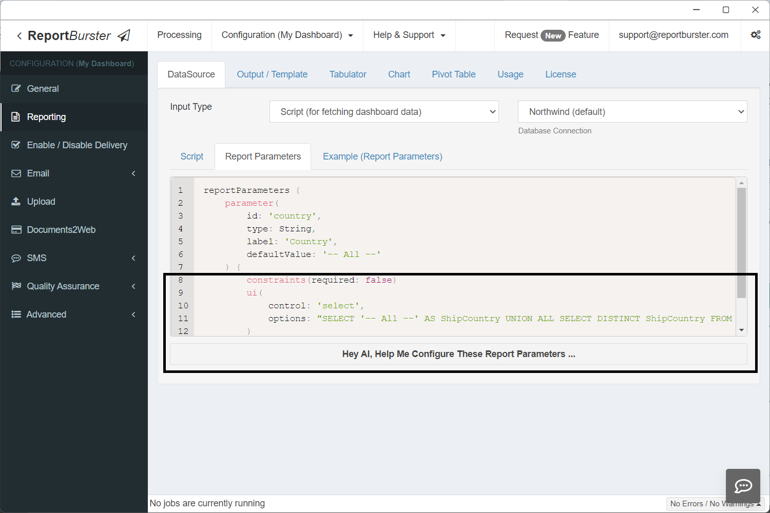
reportParameters {
    parameter(
        id: 'country',
        type: String,
        label: 'Country',
        defaultValue: '-- All --'
    ) {
        constraints(required: false)
        ui(
            control: 'select',
            options: "SELECT '-- All --' AS ShipCountry UNION ALL SELECT DISTINCT ShipCountry FROM Orders WHERE ShipCountry IS NOT NULL ORDER BY ShipCountry"
        )
    }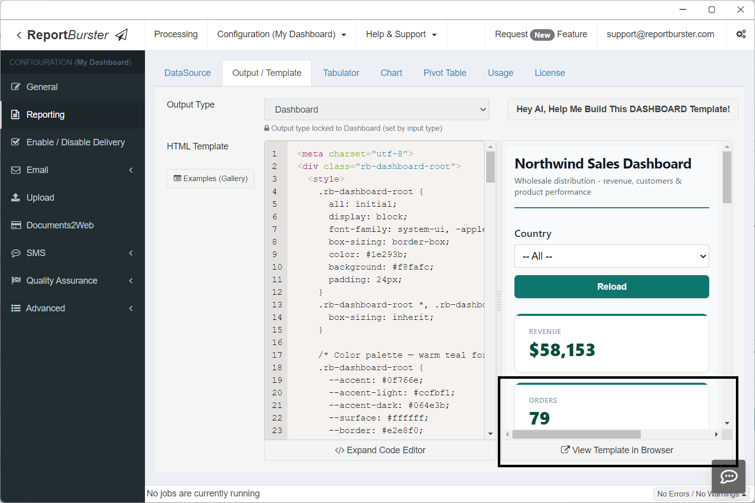
}Step 5: The Dashboard Template
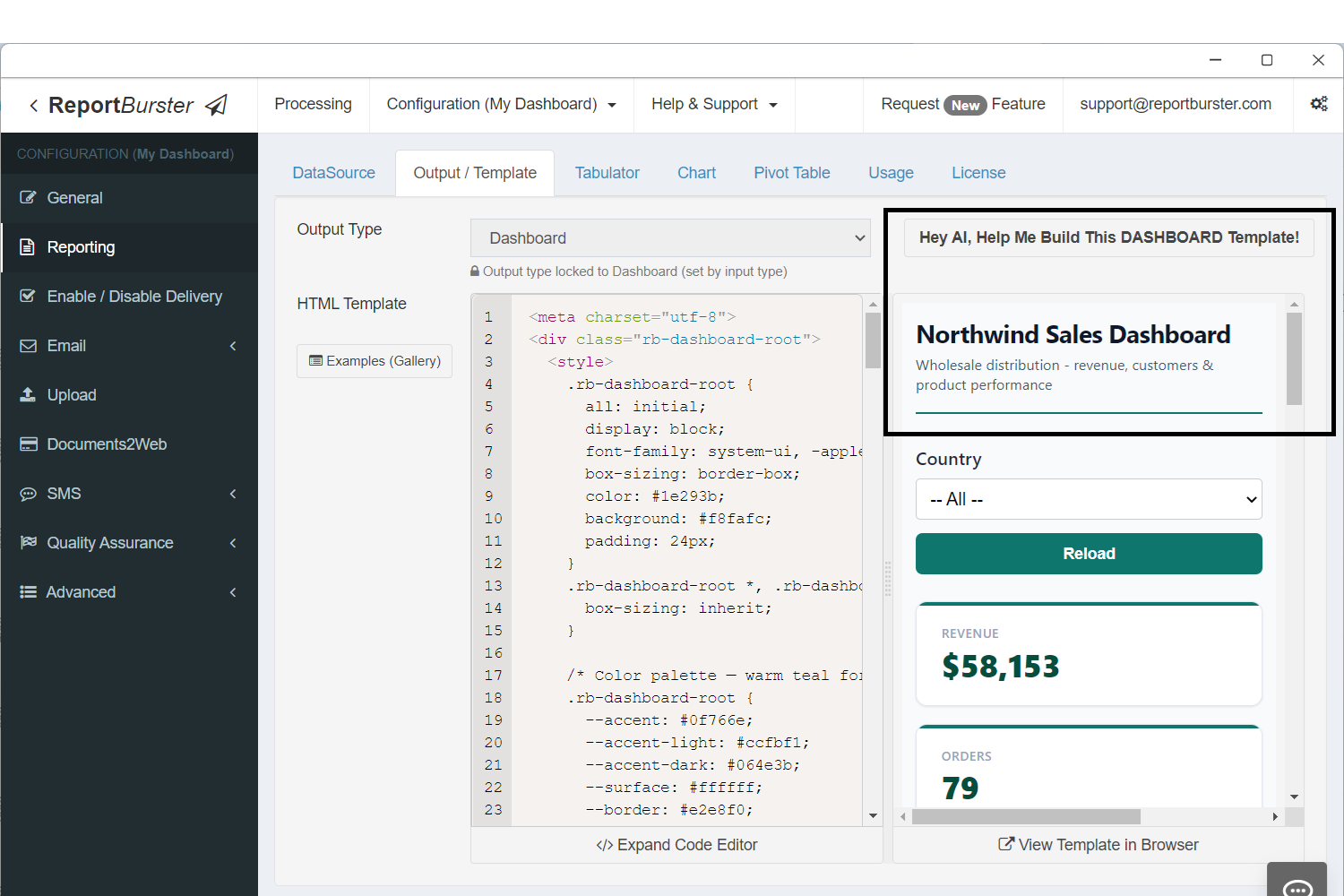
Same idea here — the AI can generate this template, but we already have one ready:
<meta charset="utf-8">
<div class="rb-dashboard-root">
<style>
.rb-dashboard-root {
all: initial;
display: block;
font-family: system-ui, -apple-system, 'Segoe UI', sans-serif;
box-sizing: border-box;
color: #1e293b;
background: #f8fafc;
padding: 24px;
}
.rb-dashboard-root *, .rb-dashboard-root *::before, .rb-dashboard-root *::after {
box-sizing: inherit;
}
/* Color palette — warm teal for a wholesale/trade feel */
.rb-dashboard-root {
--accent: #0f766e;
--accent-light: #ccfbf1;
--accent-dark: #064e3b;
--surface: #ffffff;
--border: #e2e8f0;
--text-primary: #0f172a;
--text-secondary: #475569;
--text-muted: #94a3b8;
--shadow: 0 1px 3px rgba(0,0,0,0.06), 0 1px 2px rgba(0,0,0,0.04);
--radius: 10px;
}
/* Header */
.rb-dashboard-root .dash-header {
display: flex;
justify-content: space-between;
align-items: flex-end;
margin-bottom: 28px;
padding-bottom: 16px;
border-bottom: 2px solid var(--accent);
}
.rb-dashboard-root .dash-title {
font-size: 22px;
font-weight: 700;
color: var(--text-primary);
letter-spacing: -0.3px;
margin: 0;
}
.rb-dashboard-root .dash-subtitle {
font-size: 13px;
color: var(--text-secondary);
margin: 4px 0 0 0;
font-weight: 400;
}
/* Parameters */
.rb-dashboard-root .params-bar {
margin-bottom: 24px;
}
/* KPI row */
.rb-dashboard-root .kpi-row {
display: grid;
grid-template-columns: repeat(4, 1fr);
gap: 16px;
margin-bottom: 28px;
}
.rb-dashboard-root .kpi-card {
background: var(--surface);
border: 1px solid var(--border);
border-radius: var(--radius);
padding: 20px 22px;
box-shadow: var(--shadow);
position: relative;
overflow: hidden;
}
.rb-dashboard-root .kpi-card::before {
content: '';
position: absolute;
top: 0; left: 0; right: 0;
height: 3px;
background: var(--accent);
}
.rb-dashboard-root .kpi-label {
font-size: 11px;
font-weight: 600;
text-transform: uppercase;
letter-spacing: 0.6px;
color: var(--text-muted);
margin: 0 0 6px 0;
}
.rb-dashboard-root .kpi-value {
font-size: 28px;
font-weight: 800;
color: var(--accent-dark);
margin: 0;
line-height: 1.1;
}
/* Charts row */
.rb-dashboard-root .charts-row {
display: grid;
grid-template-columns: 2fr 1fr;
gap: 20px;
margin-bottom: 28px;
}
.rb-dashboard-root .card {
background: var(--surface);
border: 1px solid var(--border);
border-radius: var(--radius);
padding: 20px;
box-shadow: var(--shadow);
}
.rb-dashboard-root .card-title {
font-size: 14px;
font-weight: 700;
color: var(--text-primary);
margin: 0 0 16px 0;
letter-spacing: -0.2px;
}
/* Table section */
.rb-dashboard-root .table-section {
margin-bottom: 28px;
}
/* Pivot section */
.rb-dashboard-root .pivot-section {
margin-bottom: 12px;
}
/* Responsive */
@media (max-width: 900px) {
.rb-dashboard-root .kpi-row { grid-template-columns: repeat(2, 1fr); }
.rb-dashboard-root .charts-row { grid-template-columns: 1fr; }
}
@media (max-width: 500px) {
.rb-dashboard-root .kpi-row { grid-template-columns: 1fr; }
.rb-dashboard-root { padding: 12px; }
}
</style>
<!-- Header -->
<div class="dash-header">
<div>
<h1 class="dash-title">Northwind Sales Dashboard</h1>
<p class="dash-subtitle">Wholesale distribution - revenue, customers & product performance</p>
</div>
</div>
<!-- Parameters -->
<div class="params-bar">
<rb-parameters report-id="dashboard-test" api-base-url="http://localhost:9090/api/jobman/reporting" show-reload="true"></rb-parameters>
</div>
<!-- KPI Cards — all 4 share component-id="atomicValues" (1 fetch, cached), each picks a different field -->
<div class="kpi-row">
<div class="kpi-card">
<p class="kpi-label">Revenue</p>
<p class="kpi-value">
<rb-value report-id="dashboard-test" api-base-url="http://localhost:9090/api/jobman/reporting" component-id="atomicValues" field="revenue" format="currency"></rb-value>
</p>
</div>
<div class="kpi-card">
<p class="kpi-label">Orders</p>
<p class="kpi-value">
<rb-value report-id="dashboard-test" api-base-url="http://localhost:9090/api/jobman/reporting" component-id="atomicValues" field="orders" format="number"></rb-value>
</p>
</div>
<div class="kpi-card">
<p class="kpi-label">Avg Order Value</p>
<p class="kpi-value">
<rb-value report-id="dashboard-test" api-base-url="http://localhost:9090/api/jobman/reporting" component-id="atomicValues" field="avgOrderValue" format="currency"></rb-value>
</p>
</div>
<div class="kpi-card">
<p class="kpi-label">Customers</p>
<p class="kpi-value">
<rb-value report-id="dashboard-test" api-base-url="http://localhost:9090/api/jobman/reporting" component-id="atomicValues" field="customers" format="number"></rb-value>
</p>
</div>
</div>
<!-- Charts -->
<div class="charts-row">
<div class="card">
<h2 class="card-title">Revenue Trend</h2>
<rb-chart report-id="dashboard-test" api-base-url="http://localhost:9090/api/jobman/reporting" component-id="revenueTrend"></rb-chart>
</div>
<div class="card">
<h2 class="card-title">Revenue by Category</h2>
<rb-chart report-id="dashboard-test" api-base-url="http://localhost:9090/api/jobman/reporting" component-id="revenueByCategory"></rb-chart>
</div>
</div>
<!-- Top Customers Table -->
<div class="table-section">
<div class="card">
<h2 class="card-title">Top 10 Customers</h2>
<rb-tabulator report-id="dashboard-test" api-base-url="http://localhost:9090/api/jobman/reporting" component-id="topCustomers"></rb-tabulator>
</div>
</div>
<!-- Order Explorer Pivot -->
<div class="pivot-section">
<div class="card">
<h2 class="card-title">Order Explorer</h2>
<rb-pivot-table report-id="dashboard-test" api-base-url="http://localhost:9090/api/jobman/reporting" component-id="orderExplorer"></rb-pivot-table>
</div>
</div>
</div>Notice how all the rb-* web components — rb-value, rb-parameters, rb-chart, rb-tabulator, and rb-pivot-table — are used across the dashboard. The data for each of these components is fetched by the script you previously configured. Each component's component-id matches the names used in ctx.reportData() in the data script.
Step 6: Configure Tabulator, Charts & Pivot Table Components
In this step you'll configure the individual components: rb-tabulator controls which columns to show, formatting, sorting, filtering, and many other visual aspects; rb-chart configures how charts look visually — type, colors, labels, and layout; and rb-pivot-table defines which columns are available for rows, columns, and values, along with other pivot table settings.
Tabulator tab:
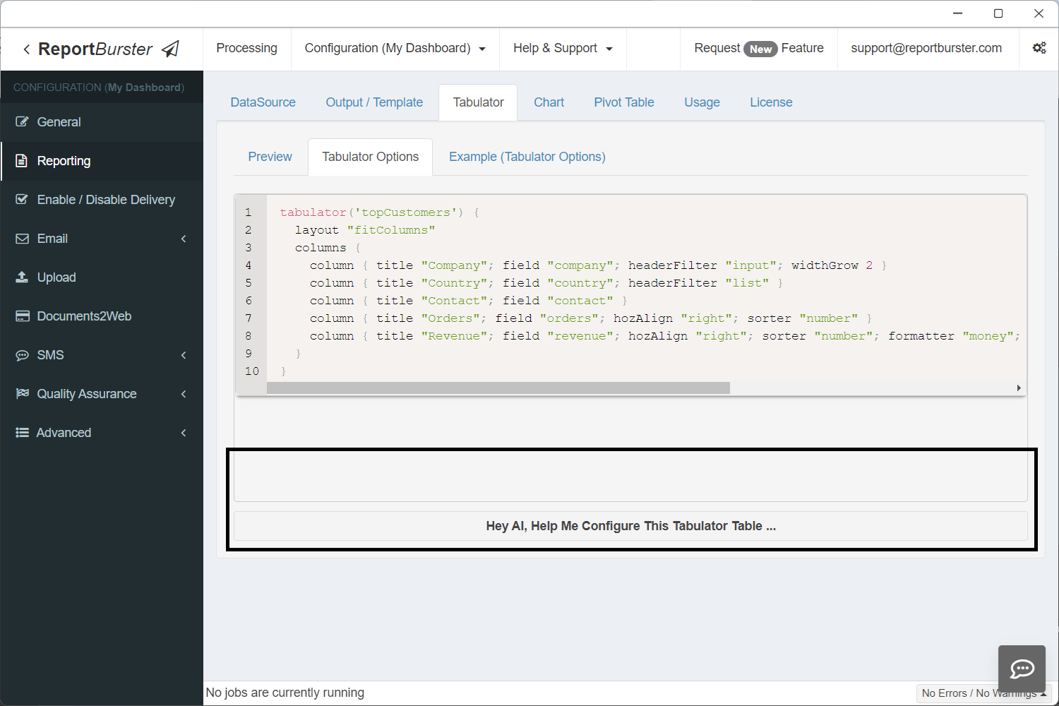
tabulator('topCustomers') {
  layout "fitColumns"
  columns {
    column { title "Company"; field "company"; headerFilter "input"; widthGrow 2 }
    column { title "Country"; field "country"; headerFilter "list" }
    column { title "Contact"; field "contact" }
    column { title "Orders"; field "orders"; hozAlign "right"; sorter "number" }
    column { title "Revenue"; field "revenue"; hozAlign "right"; sorter "number"; formatter "money"; formatterParams([thousand: ',', symbol: '$', precision: 2]) }
  }
}'topCustomers' — the same ID used in ctx.reportData('topCustomers', data) in the script and component-id="topCustomers" in the HTML template.
Chart tab:
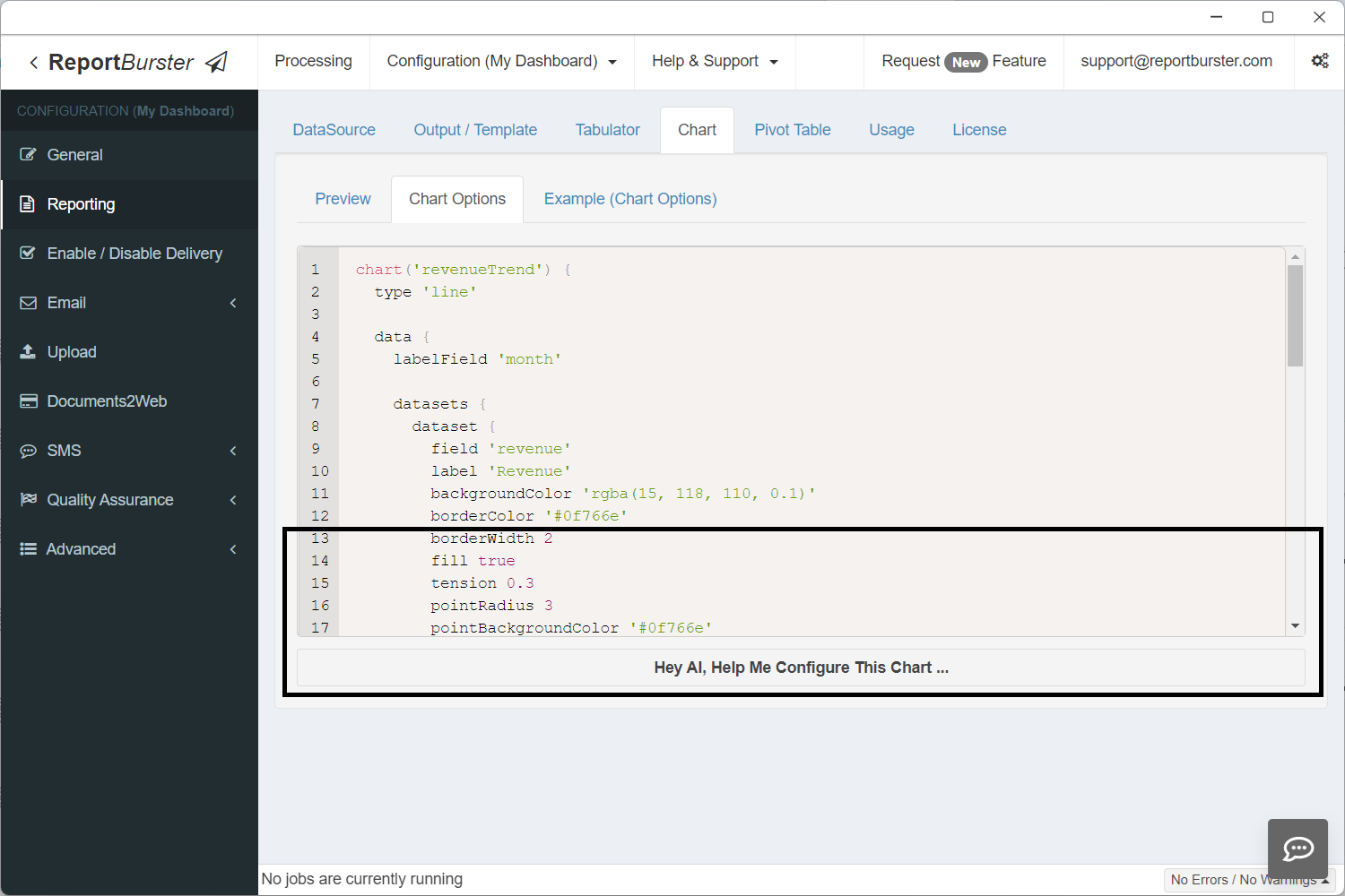
chart('revenueTrend') {
  type 'line'

  data {
    labelField 'month'

    datasets {
      dataset {
        field 'revenue'
        label 'Revenue'
        backgroundColor 'rgba(15, 118, 110, 0.1)'
        borderColor '#0f766e'
        borderWidth 2
        fill true
        tension 0.3
        pointRadius 3
        pointBackgroundColor '#0f766e'
      }
    }
  }

  options {
    plugins {
      legend { display false }
    }
    scales {
      y {
        beginAtZero true
        title { display true; text 'Revenue ($)' }
      }
      x {
        title { display true; text 'Month' }
      }
    }
  }
}
chart('revenueByCategory') {
  type 'doughnut'

  data {
    labelField 'category'

    datasets {
      dataset {
        field 'revenue'
        label 'Revenue'
        backgroundColor(['#0f766e', '#e15759', '#4e79a7', '#f28e2b', '#76b7b2', '#59a14f', '#edc949', '#af7aa1'])
        borderColor '#ffffff'
        borderWidth 2
      }
    }
  }

  options {
    plugins {
      legend { position 'right' }
    }
  }
}'revenueTrend' and 'revenueByCategory' — the same IDs used in ctx.reportData('revenueTrend', data) / ctx.reportData('revenueByCategory', data) in the script and component-id="revenueTrend" / component-id="revenueByCategory" in the HTML template.
Pivot Table tab:
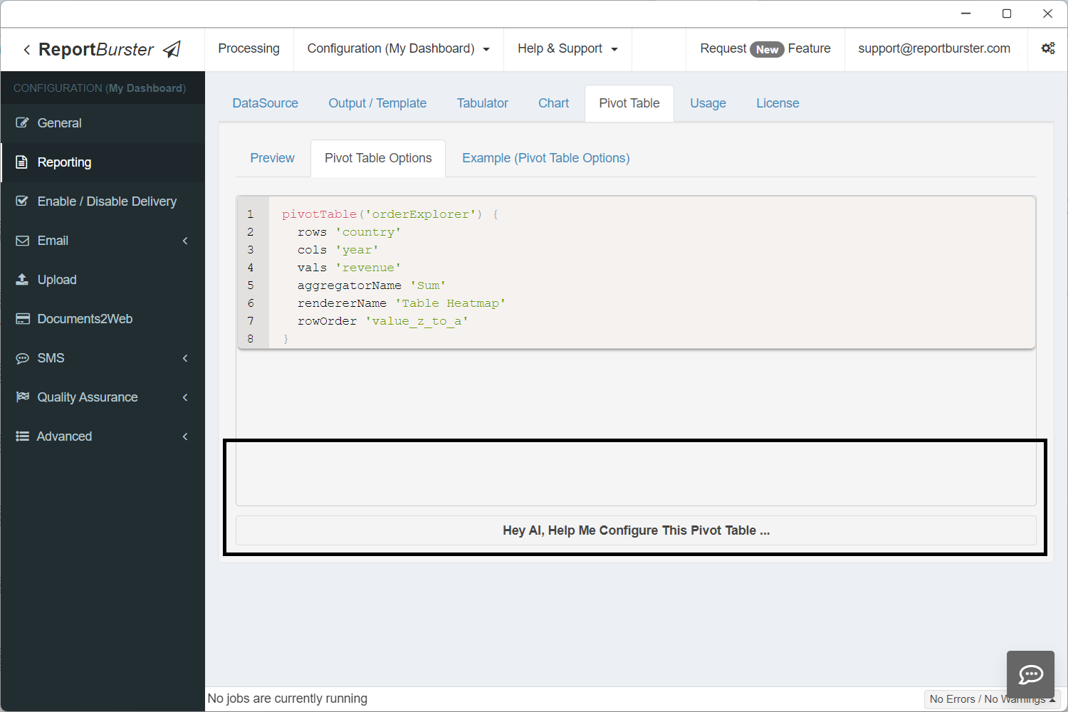
pivotTable('orderExplorer') {
  rows 'country'
  cols 'year'
  vals 'revenue'
  aggregatorName 'Sum'
  rendererName 'Table Heatmap'
  rowOrder 'value_z_to_a'
}'orderExplorer' — the same ID used in ctx.reportData('orderExplorer', data) in the script and component-id="orderExplorer" in the HTML template.
Step 7: View Your Dashboard
Step 8: Share Your Dashboard
All dashboards created with DataPallas are embeddable — go to the Usage tab to find how.
DataPallas dashboards can be embedded in any external web application using the <rb-dashboard> web component.
The exact syntax is shown in the screenshot below.
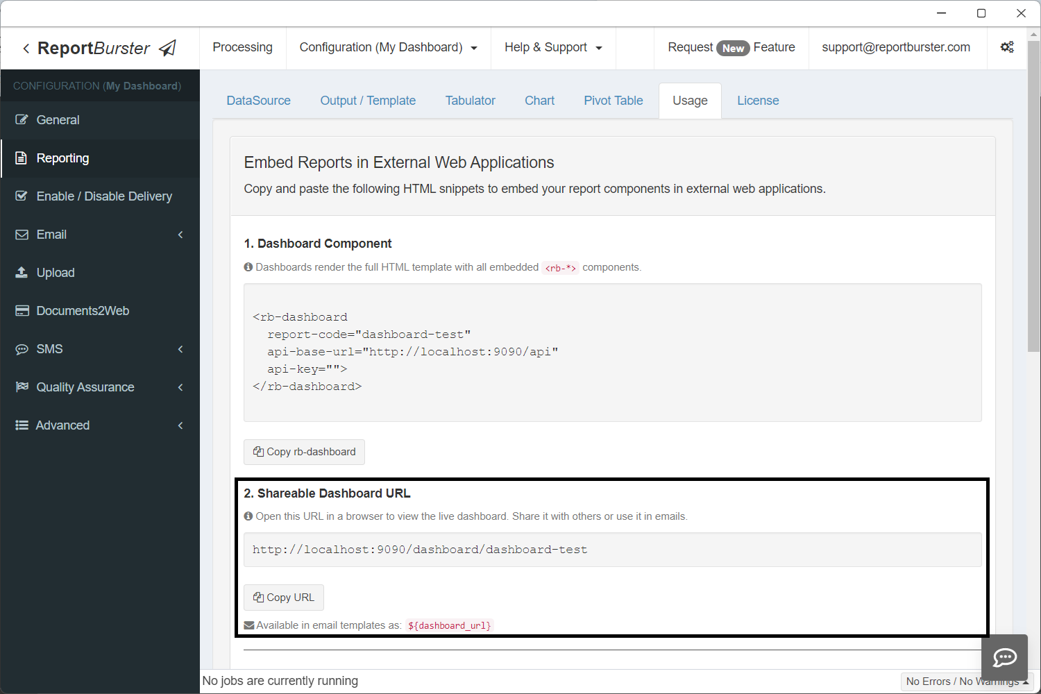
In addition, every dashboard gets a shareable URL automatically.
The dashboard URL is also available as the built-in variable ${dashboard_url} in email templates. Combined with DataPallas's scheduling capabilities, you can set up automated emails that send dashboard links to stakeholders on a recurring schedule — daily, weekly, monthly, or any custom interval. Recipients click the link and see the live, always-up-to-date dashboard.
The Building Blocks
Every dashboard you build with DataPallas is assembled from these components:
| Component | What It Does | Dashboard Use |
|---|---|---|
<rb-parameters> | Date pickers, dropdowns, filters | Dashboard-wide filters (date range, department, region) |
<rb-tabulator> | Interactive data grid with sorting, filtering, pagination | Detail tables, transaction lists, drill-down views |
<rb-chart> | Bar, line, pie, area, scatter, and more | Trends, distributions, comparisons |
<rb-pivot-table> | Multi-dimensional drag-and-drop analysis | Revenue breakdowns, cross-tabulations, ad-hoc exploration |
<rb-report> | Complete report viewer combining all of the above | Full self-contained report pages |
<rb-value> | Displays a single scalar value — a number, text, or date that doesn't belong in a table or chart (see Atomic Values below) | Summary cards, totals, counts, averages |
Each component connects to your data through DataPallas's backend — whether that data lives in a transactional database, DuckDB, or ClickHouse. Mix and match them on a single page to create exactly the dashboard you need.
Atomic Values (rb-value)
The <rb-value> component displays a single value — a revenue total, order count, average, calculated result, or any scalar. The value can come from a database query, a computation in your script, or any other source. It renders as a plain inline <span> with no table or chart overhead.
Attributes
| Attribute | Required | Description |
|---|---|---|
report-id | Yes | Report folder name |
api-base-url | Yes | Base URL for API |
component-id | Yes | Matches ctx.reportData('id', data) in the data script |
field | Yes | Column name from the query result to display |
format | No | currency ($58,153), number (1,234), percent (73%), date (Mar 15, 2024), or omit for raw value |
Multiple Values with Shared Fetch
Multiple <rb-value> elements with the same component-id make one HTTP request — the result is cached client-side and each element picks its column via field:
<!-- 1 SQL query, 1 HTTP request, 4 value cards -->
<div class="value-card">
  <span class="label">Revenue</span>
  <rb-value report-id="dashboard" api-base-url="http://localhost:9090/api/jobman/reporting"
            component-id="atomicValues" field="revenue" format="currency"></rb-value>
</div>
<div class="value-card">
  <span class="label">Orders</span>
  <rb-value report-id="dashboard" api-base-url="http://localhost:9090/api/jobman/reporting"
            component-id="atomicValues" field="orders" format="number"></rb-value>
</div>
<div class="value-card">
  <span class="label">Avg Order Value</span>
  <rb-value report-id="dashboard" api-base-url="http://localhost:9090/api/jobman/reporting"
            component-id="atomicValues" field="avgOrderValue" format="currency"></rb-value>
</div>
<div class="value-card">
  <span class="label">Customers</span>
  <rb-value report-id="dashboard" api-base-url="http://localhost:9090/api/jobman/reporting"
            component-id="atomicValues" field="customers" format="number"></rb-value>
</div>Script
Return all values as columns in a single row. No extra configuration is needed.
if (!componentId || componentId == 'atomicValues') {
    def data = dbSql.rows("""
        SELECT
            ROUND(SUM(od.UnitPrice * od.Quantity), 0) AS revenue,
            COUNT(DISTINCT o.OrderID) AS orders,
            ROUND(SUM(od.UnitPrice * od.Quantity) / COUNT(DISTINCT o.OrderID), 0) AS avgOrderValue,
            COUNT(DISTINCT o.CustomerID) AS customers
        FROM Orders o
        JOIN "Order Details" od ON o.OrderID = od.OrderID
    """)
    ctx.reportData('atomicValues', data)
}The column aliases (revenue, orders, avgOrderValue, customers) match the field attributes on the HTML elements.
Supported Databases
Next: Make It Fast
Your dashboard is designed and assembled. Now make it performant. The Performance & Real-Time guide covers the implementation details — multi-component report configuration, efficient data loading with componentId, Redis caching for expensive queries, and real-time data patterns.