Explore Data on the Canvas
Five-minute walkthrough using the bundled Northwind SQLite sample database — drop a cube, pick a visualization, refine, drop a second widget.
Table of Contents
- Before You Start
- Step 1 — Start the Canvas App and Launch It
- Step 2 — Drop a Sample Cube
- Step 3 — Pick a Visualization
- Step 4 — Tweak the Query Visually
- Step 5 — Add a Second Widget
- Where to Go Next
Before You Start
You need:
- DataPallas running locally
- Docker Desktop (Windows/macOS) or Docker Engine (Linux) installed and running — the Explore Data Canvas runs as a Docker container. DataPallas detects Docker automatically and warns if it isn't available.
In day-to-day use you'll obviously connect this to your own database. For the sake of learning, we'll use the bundled Northwind (SQLite) sample connection and the five pre-configured sample cubes (Customer Management, Human Resources, Product Inventory, Sales Analysis, Sales Warehouse) that ship with DataPallas.
If you've never created a database connection before, follow DB Connections first.
Step 1 — Start the Canvas App and Launch It
The Explore Data Canvas runs as a Docker container alongside DataPallas. It needs to be started once before you can use it.
From the top menu, open Processing → Explore Data & Build Dashboards. Click Start, wait until the status shows running (a few seconds while the container boots). The Launch button becomes available once the app is started.
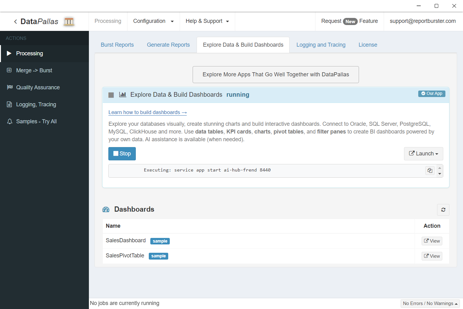
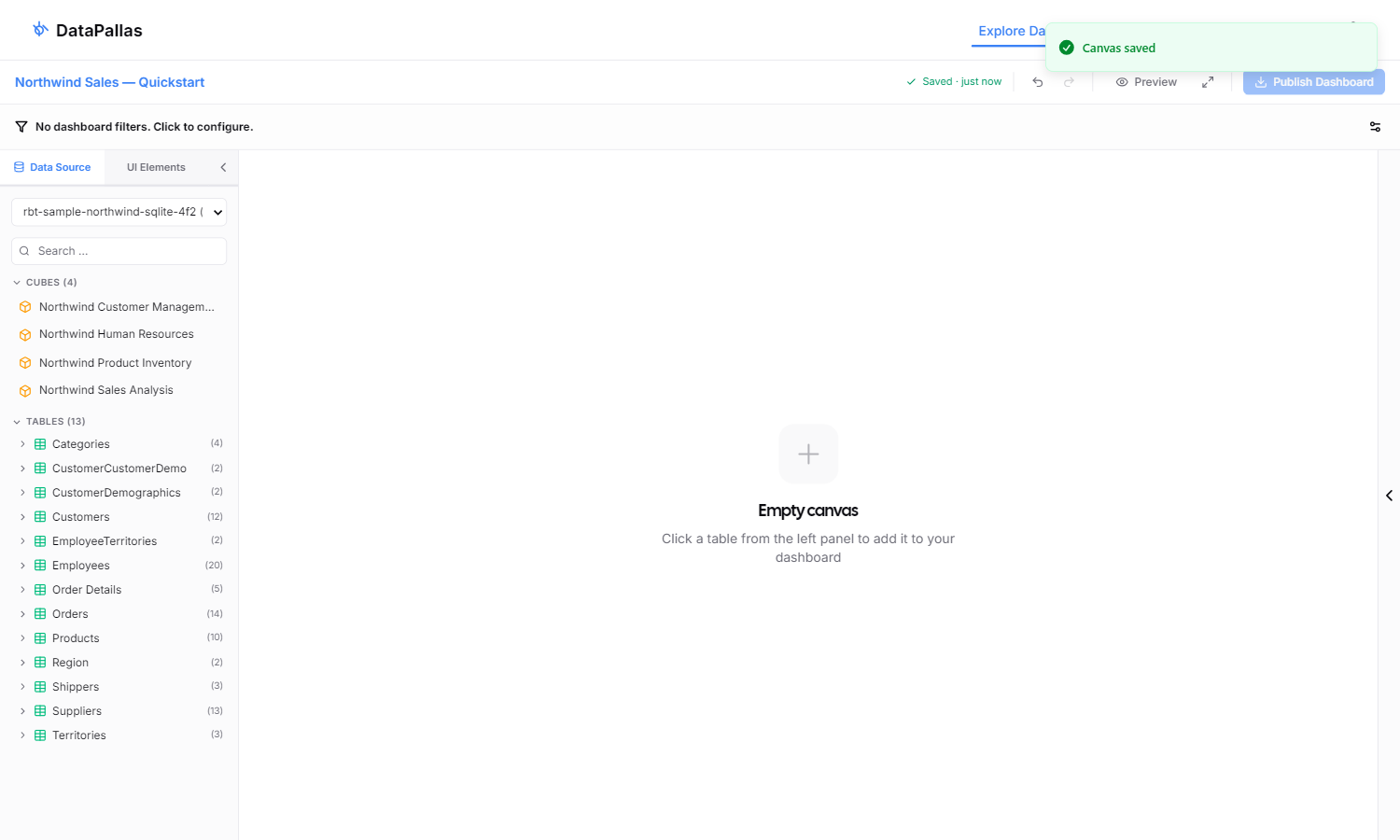
Click Launch — a new browser tab opens at http://localhost:8440/explore-data with a blank canvas and three panels:
- Left — Data Source browser, listing connections, cubes, and tables
- Center — the canvas itself, where widgets render
- Right — Configuration panel, opens automatically when you select a widget
Pick the Northwind Sample (SQLite) connection from the dropdown at the top of the left panel. The five bundled sample cubes appear under CUBES.
Step 2 — Drop a Sample Cube
In the left panel, click Northwind Sales Analysis under CUBES. A widget appears on the canvas and the right panel auto-opens with the cube's dimensions and measures listed.
Tick Supplier under dimensions and Revenue, Order Count and Units Sold under measures to see immediate results. The widget defaults to Detail — for a clearer first look, click Table in the VISUALIZE AS strip on the right.
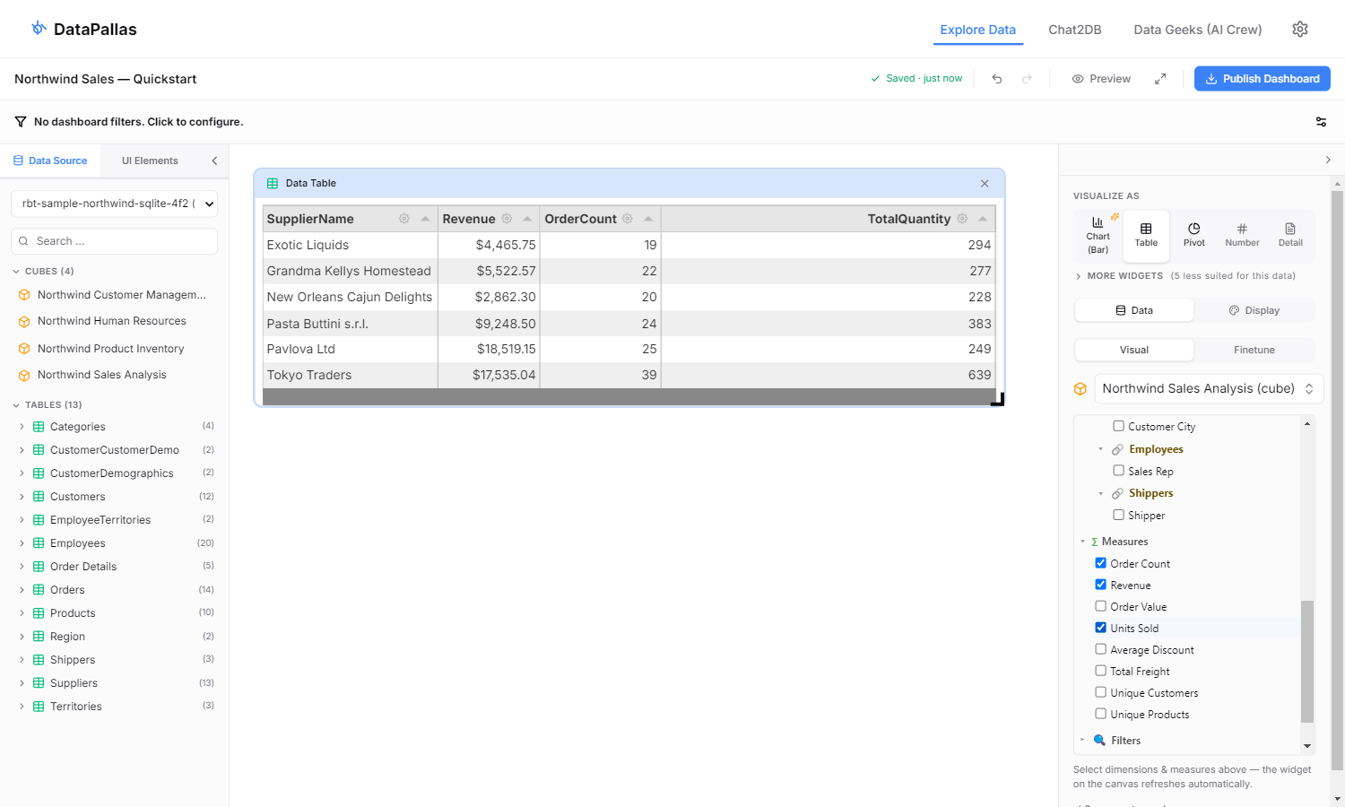
Cubes do the heavy lifting for you: business-friendly names instead of cryptic columns, joins already wired between orders and customers, and aggregations defined once. You don't have to know the schema or remember any SQL.
Step 3 — Pick a Visualization
In the right panel under VISUALIZE AS, switch between Table, Chart, Pivot, Map, Number, Sankey, and the rest. Each one renders the same data in a different shape — the canvas suggests the most appropriate type based on what you've selected, but you can override anytime.
Step 4 — Tweak the Query Visually
Stay on the Data tab in the right panel — that's Visual mode, the default. Drag columns from the cube into the four buckets at the bottom:
- Filter — narrow which rows to include (e.g.
OrderDateafter 2024-01-01) - Summarize — aggregations: sum, avg, count, min, max
- Group By — what to break the totals down by; for time columns you can bucket by day / week / month / quarter / year
- Sort and Limit — order and cap the result
Try this: drag OrderDate into Group By (bucket by month), drag Freight into Summarize (sum), pick Chart from the Visualize As strip. You now have monthly freight cost as a line chart.
If you'd rather hand-edit SQL, switch to the Finetune tab — write raw SQL, paste an AI-generated query, or write a Groovy script for anything the visual builder can't express. Click Hey AI, Help Me… at any point and describe what you want; the AI drafts the SQL or the script for you against your live schema.
Step 5 — Add a Second Widget
Click the cube in the left panel again — or another one like Northwind Customer Management — to drop a second widget. Tick the same fields, then in the VISUALIZE AS strip on the right panel pick Chart. Now you have the same data rendered two ways side-by-side: a Table showing the raw rows and a Chart showing the totals visually.
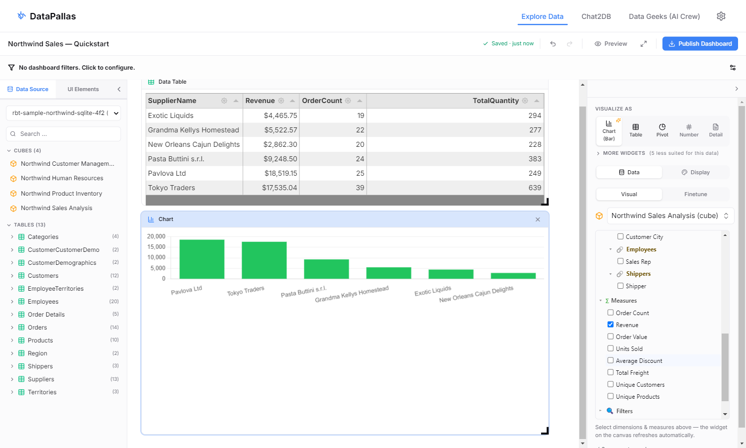
Mix and match: a Table for inspecting rows, a Chart for spotting trends, a KPI Number for headline totals. Every change you make is auto-saved — the toolbar shows Saved · just now. You can close the tab and come back later, undo or redo any edit, or open multiple canvases in parallel for different exploration tracks.
Where to Go Next
- Try a different cube — drop Northwind Sales Warehouse or define your own
- Need a number that doesn't exist as a cube measure? Switch to Finetune and write the SQL — or have Hey AI, Help Me… draft it
- Want to share the results? Once you're happy with the layout, head over to BI Analytics for the next step
- Curious about cubes themselves? Read Semantic Layer (Cubes) and the DSL Reference