Data Exploration
Connect to any database, understand your data model, and explore data with AI — without exposing your data to AI vendors.
Table of Contents
- Pre-Configured Reports Get You Far
- Explore Data on a Canvas
- Widgets at a Glance
- AI Takes Data Exploration Further
- What About Data Privacy?
- Next Steps
Pre-Configured Reports Get You Far
PDF documents, pivot tables, dashboards — these are powerful tools for analyzing business data and they deliver tremendous value. But at some point you want to go deeper — ask a question nobody anticipated, slice the data from a new angle, or explore a hunch. Pre-configured views, by definition, can only show what was planned in advance.
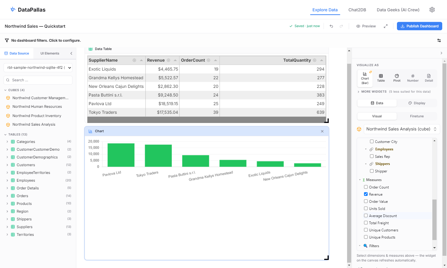
Explore Data on a Canvas
The Explore Data Canvas is a drag-and-drop workspace for poking at your data. Pick a table or a semantic-layer cube from the left panel, drop it on the canvas, and a widget appears rendering live. Switch between Tables, Charts, Pivots, Maps, KPI Numbers, Sankey diagrams and more from the right panel. Drag columns into Filter / Group By / Summarize / Sort to refine. Drop another widget next to it. Add a shared filter at the top and watch every widget re-query at once.
Two things make the canvas different from a typical SQL editor:
- Visual mode — many questions can be explored visually without writing much SQL. Drag columns, pick a chart type, see results. Smart defaults pick a sensible visualization based on the shape of your data.
- Finetune mode — for the cases where the visual builder isn't enough. Drop into raw SQL or a script when you need an aggregation, transformation, or query logic the UI controls can't express.
If you're stuck on the query, click any Hey AI, Help Me… button and tell the AI what you want — it drafts the SQL or the script which you need for you against your live schema.
Cubes shine here. Drop a cube and you immediately see business-named dimensions and measures, with the joins already wired — no remembering foreign keys, no GROUP BY typos. Tables work too: drop a raw table when you want to look at columns directly.
Widgets at a Glance
The canvas supports 10+ widget types, each best suited to a different question:
- Table — interactive grid for raw rows, with sorting and column controls
- Chart — bar, line, pie, area, scatter, combo — DataPallas suggests the appropriate sub-type from the data shape
- Pivot — drag-and-drop pivot table for crosstab analysis
- Sankey — flows between categories (e.g. customer → product → region)
- Map — geo-mapped values when you have country / region / city columns
- Number / Gauge / Progress — single-value KPIs with thresholds and targets
- Trend — line chart with period-over-period change percentages
- Detail — single-row inspector for a specific record
- Filter Pane / Divider / Text / Iframe — structural pieces to lay out a workspace
Pick one in the Visualize As strip on the right panel; switch any time without losing your data selection.
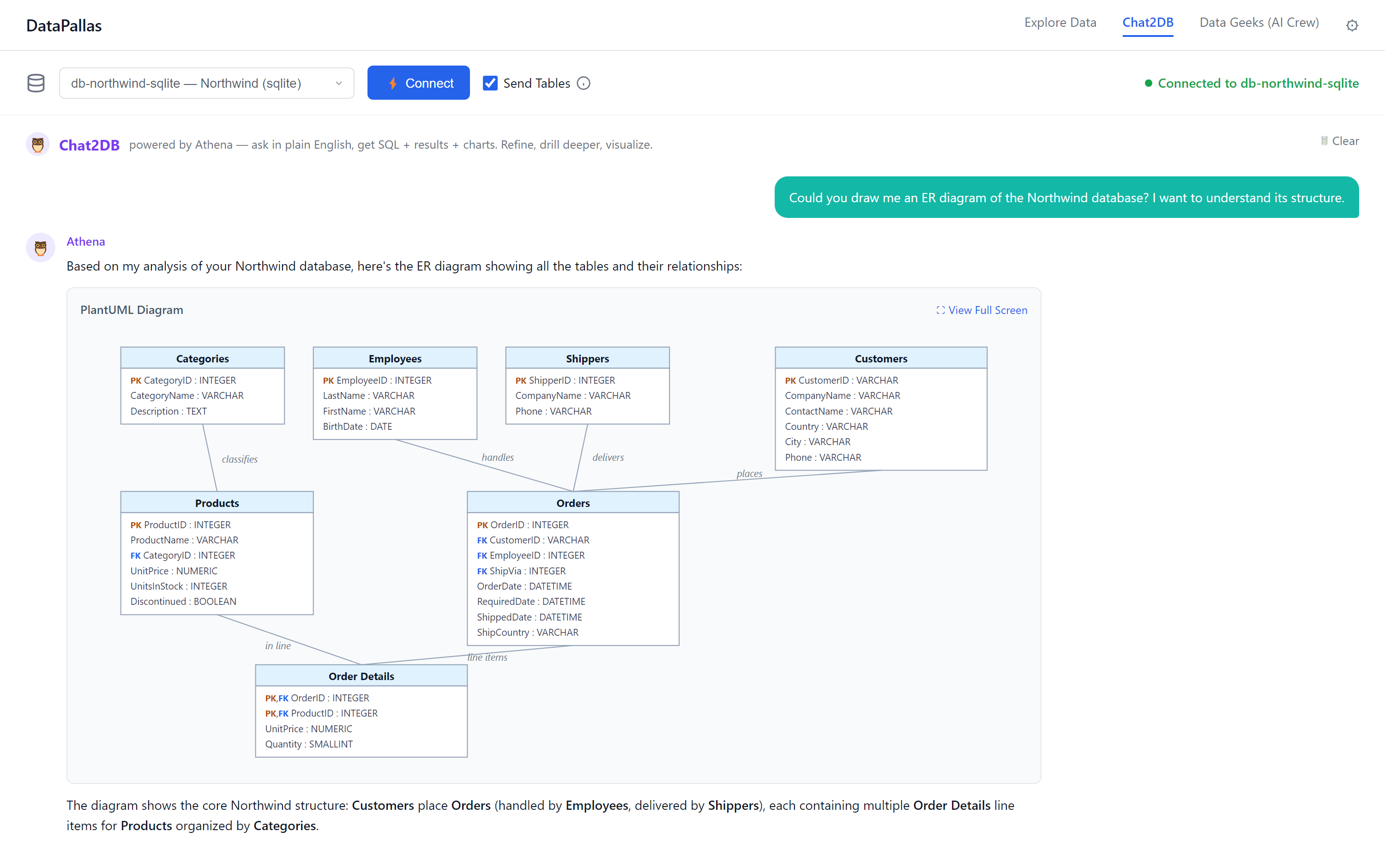
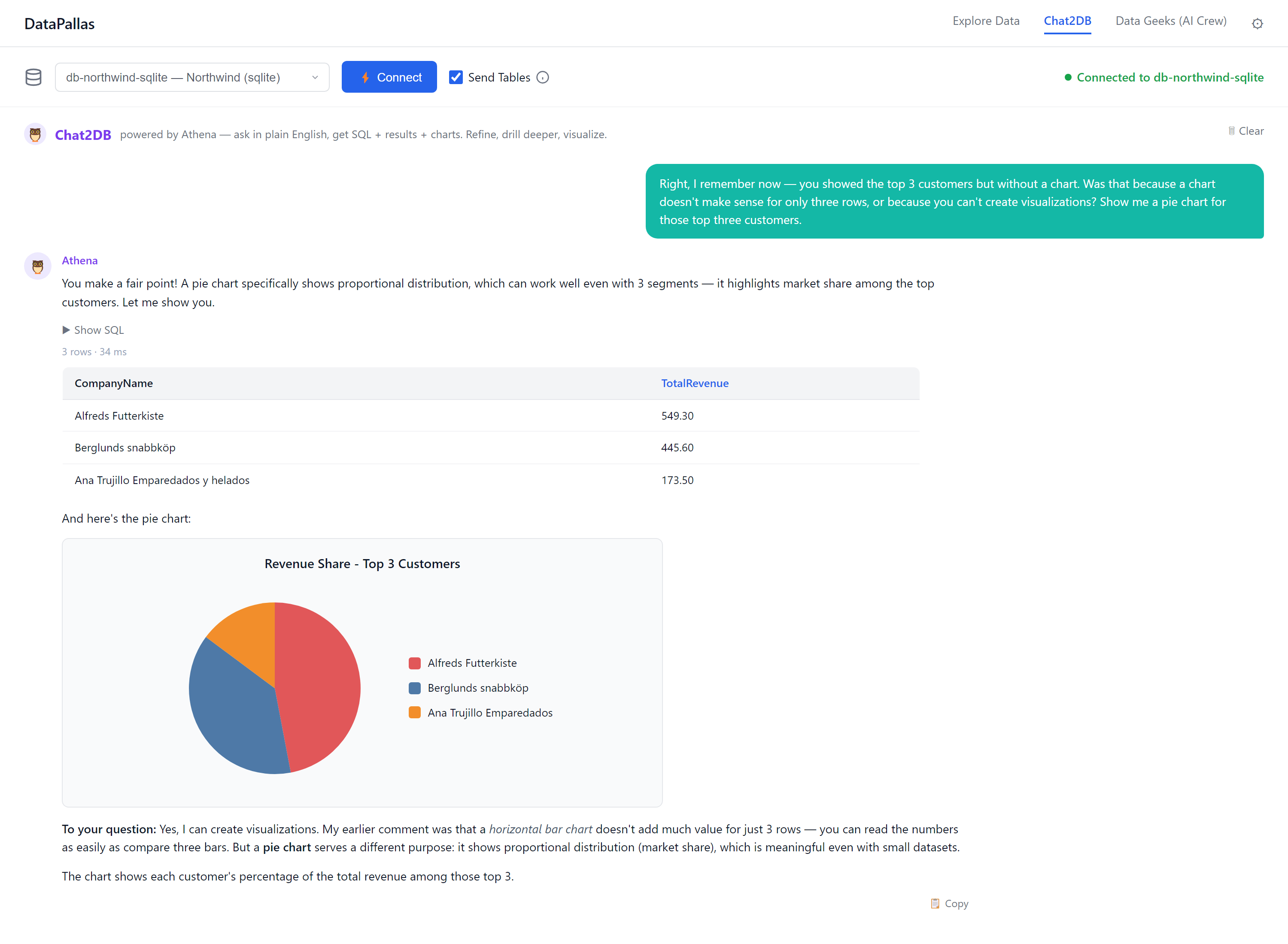
AI Takes Data Exploration Further
The canvas gets you far. But what if you want to go even deeper — not just explore your data, but speak with it? Ask it questions in plain English and have someone explain the results?
That's what AI brings. Instead of building queries manually, you describe what you want and get back SQL, charts, and plain-English explanations — instantly. More importantly, AI handles the open-ended questions that go beyond any dashboard:
- "Which tables in my database are most relevant to sales performance?"
- "Show me revenue trends by region — and suggest a better way to visualize this."
- "You've seen thousands of CRM databases. What queries do people usually find valuable for a schema like mine?"
AI brings pattern recognition across industries and domains. You bring the context of your specific situation. Together, you reach useful insights faster than either could alone.
Two examples from a real Chat2DB conversation against the bundled Northwind sample — ask in plain English, get back diagrams, SQL, results, and charts:
What About Data Privacy?
AI-powered analysis sounds compelling — but does it mean handing your data to an AI vendor? Your most valuable data — the data you most want to analyze — is often the data you least want to share.
DataPallas was designed with this tension in mind. When you use AI for data exploration, your data is not sent to the AI vendor. The AI works with your database schema and metadata — not with the actual data rows.
For the full explanation, read
Next Steps
- Explore Data on the Canvas — five-minute walkthrough using the bundled Northwind sample cubes
- Chat2DB AI — ask questions about your data in plain English and get SQL, charts, and insights
- Database Connections — connect to your database, explore the schema, generate ER diagrams, and build a shared understanding of your data model